A bathroom can feel cold or flat even when it’s clean and updated. That’s why I often recommend green in renovation consults. The right green adds softness, warmth, and a calm “exhale” feeling, without needing a full remodel.
In my projects, green works because it plays well with the materials bathrooms already have, like tile, stone, glass, and metal. It can look fresh and airy in a small powder room, or rich and cozy in a larger primary bath. The trick is choosing a shade that suits your light, your finishes, and your tolerance for bold color.
Snippet-ready definition:
Green bathroom paint is wall or vanity paint in green tones (sage, olive, mint, emerald) used to create a calm, spa-like feel. People choose it because it pairs well with tile, metals, and natural materials.
Mission Statement:
At Dwellify Home, we help everyday homeowners make confident design choices with practical, experience-backed guidance, so your space looks beautiful, functions well, and feels like you.
Why green works so well in bathrooms (the feel + the logic)
Green sits right in the comfort zone between “color” and “neutral.” In real homes, it’s often easier to live with than bright blues or heavy charcoals because it still feels grounded and natural.
It also helps bathrooms feel more connected to the rest of the home. Many popular living room and bedroom palettes already use warm whites, woods, black accents, or brass, and green pairs neatly with all of them. From a design standpoint, that makes green a smart bridge color when you want the bathroom to feel intentional, not like a separate little box.
On a practical level, green hides everyday marks better than pure white. Water spots, tiny scuffs near the towel bar, and the usual wear around light switches tend to blend in more softly, especially with muted shades like sage or eucalyptus.
Quick Guide Table (comparison)
| Green Shade | Best For | Looks Like | Pairs Best With | Watch Out For |
| Light Green (mint, seafoam) | Small or low-light baths | Airy, fresh | White tile, chrome, bright counters | Can feel cool under harsh LEDs |
| Sage Green | Most bathrooms | Soft, timeless | Warm white, wood, brass | Can look dull if lighting is weak |
| Olive Green | Earthy, warm style | Cozy, grounded | Cream tile, wood, bronze | Can clash with cool gray tile |
| Dark Green (forest) | Larger baths, statement walls | Moody, luxury | Light counters, brass/black | Needs strong lighting balance |
| Emerald Green | Feature moments | Bold, polished | White tile, brass, clean lines | Too much can feel heavy fast |
Fast step-by-step: How to choose the right green
- Check your fixed finishes: tile, countertop, flooring
- Pick your vibe: light and fresh, soft spa, earthy, moody, or jewel-tone
- Confirm undertones: blue, yellow/olive, or gray
- Test in 3 spots: near vanity light, shadow corner, near shower
- Choose a bathroom-friendly finish: usually satin, mildew-resistant if needed
Quick shade picker, choose the best green for your bathroom
If you want a quick win, pick the green based on the mood you want and how much light your bathroom gets. In my experience, most regrets happen when someone chooses a shade that looks lovely on a phone screen but fights the bathroom’s lighting.
Light green bathroom paint is the easiest route for small bathrooms and low ceilings. It keeps things bright and clean, especially with white tile and chrome fixtures. If you like a “fresh towels and sunlight” feel, a pale green, mint, or soft seafoam can do that without looking childish.
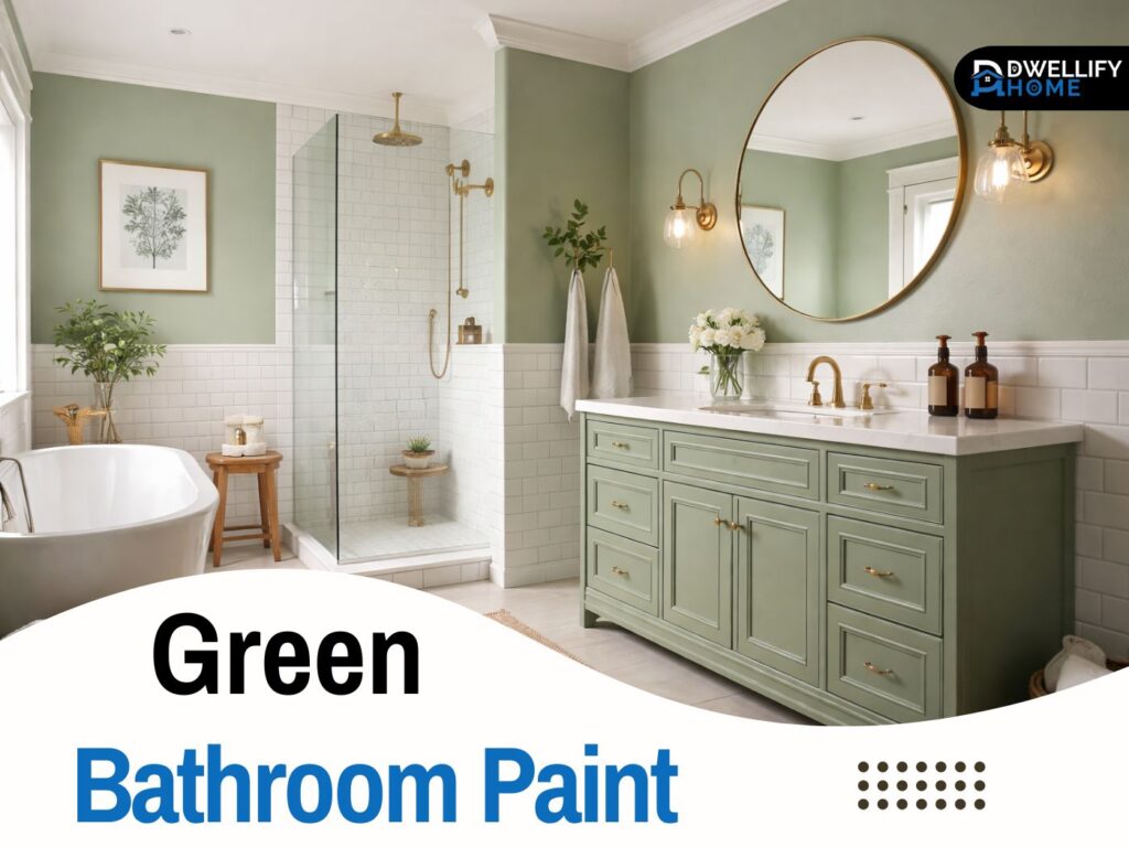
Sage green bathroom paint is the most flexible option I’ve used over the years. It’s muted, soothing, and works with almost every tile style, from classic subway to modern large-format stone. Sage also plays nicely with warm metals, wood vanities, and creamy whites, which is why it shows up in so many finished homes.
Dark green bathroom paint is for a moodier, boutique feel. Forest green and deep olive can look incredible in the right space, but they need planning. I usually recommend darker greens when you have a good vanity light, a mirror that reflects light well, and at least one element that keeps the room from feeling heavy, like light tile or a bright countertop.
Emerald green bathroom paint is bold and polished. It’s a jewel tone, so it reads “intentional” quickly, especially with brass or bronze. Emerald works best when the rest of the finishes stay calm, like white tile, warm white trim, and a simple mirror.
A few other greens show up a lot in real projects:
- Olive green for a warm, earthy look that feels modern and timeless
- Eucalyptus green for a soft spa vibe
- Mint green for a bright, clean feel that pairs well with white and chrome
Undertones matter (this is where most people get it wrong)
When clients tell me, “This green looked perfect in the store,” it’s almost always an undertone issue. Bathrooms are full of reflective surfaces, so undertones show up stronger than you expect.
The 3 undertone families to know
Blue-undertone greens feel crisp and fresh. They can read almost coastal or airy, which is great with cool whites and polished chrome. The risk is that under cool LED lighting, these shades can feel icy or a bit gray-green.
Yellow or olive-undertone greens feel warmer and more relaxed. They’re lovely with brass hardware, warmer white paint, and wood tones. The main risk is pairing them with cool gray tile, which can make the green look slightly muddy.
Gray-undertone greens are the “new neutral” in a lot of homes. This is where sage often lives. They’re forgiving, easy to style, and rarely look too loud. If you want a calm green that still feels grown-up, gray-undertone greens are a safe bet.
A simple consultant tip: hold a white sheet of paper next to the swatch. If the green suddenly looks yellowish, bluish, or smoky, that’s the undertone your bathroom will amplify.
Match green paint to your bathroom lighting and size
Lighting changes paint more in bathrooms than almost anywhere else. Between vanity bulbs, overhead lighting, and steam-softened light, a green can shift a surprising amount.
In a no-window or low-light bathroom, avoid greens that are already dark and gray-heavy. They can turn flat and dull. I lean toward lighter sage, eucalyptus, or soft green-gray shades, and I rely on good lighting to keep the walls lively. If your bulbs are very cool, switching to a warmer temperature can make the green feel healthier, not sickly.
For a small bathroom, green can still work beautifully, even darker shades, but you need balance. If the room has a dark green wall, I usually keep the vanity area bright with a lighter countertop, a large mirror, and strong task lighting. Light green bathroom paint is the simplest option if the room feels tight or has a low ceiling.
In a larger bathroom, you can use richer greens without feeling closed in. This is where forest green and deeper olive start to look luxurious. I like adding texture here, like beadboard, wainscoting, or a tile half wall, so the green feels designed rather than just “painted.”
Accent wall vs full coverage (simple rule set)
An accent wall is a smart choice when you love green but want a safer commitment. My favorite placements are:
- Behind the vanity, especially if there’s a mirror centered on it
- The wall behind a freestanding tub
- A shower wall outside the wet zone, where paint won’t be splashed daily
Full coverage looks best when your green is softer or when the bathroom has good light and strong contrast. If you paint the whole room dark green, make sure you have at least two bright elements, like light tile and a bright countertop or trim.
Where to use green paint (high-impact options besides walls)
Walls are the obvious choice, but you have other options that can look more custom and sometimes more practical.
Painting the vanity or cabinets green is one of my most-used strategies. It gives the room a focal point and keeps the walls lighter, which helps smaller bathrooms feel open. A sage or olive vanity with a warm white wall is a combination I’ve repeated many times because it looks finished and calm.
A green ceiling can look surprisingly sophisticated, especially in powder rooms. The key is to keep it soft and slightly muted. A bright green ceiling can feel playful in a way most homeowners don’t want long-term.
You can also use green on trim or the door for a subtle, tailored look. This is helpful when you have busy tile or strong stone, and you want the color to support, not compete.
Green bathroom paint ideas that look designer (not random)
If you want the room to feel designed, not accidental, build the green into a clear structure.
Wainscoting plus green paint is a classic. You can paint the lower portion a crisp white and use green above, or flip it with green below and a warm white above. This works well in family bathrooms because it adds durability and hides scuffs.
A half wall tile plus green paint above is another reliable look. I often pair a soft green above warm white tile to keep the room light, then use brass or matte black hardware to add definition.
For pattern lovers, a wallpaper moment can add personality without overwhelming the room. Leaf prints and subtle Art Deco patterns pair well with sage or emerald. I like using wallpaper on one wall only, then pulling a green from it for the surrounding paint.
If you like a softer, organic feel, a textured finish like limewash-style paint can add depth. It’s not right for every bathroom, but in a well-ventilated space, it can make the room feel warmer and less flat, especially with stone and wood.
Color pairings that always work with green bathrooms
Green plays well with neutrals, but the details matter. Your white tile might be bright and cool, or creamy and warm. That “white” decides whether your green looks crisp or muddy.
Best safe pairings
Green plus white or cream is timeless. If your tile is bright white, choose a green with a cleaner undertone. If your tile is cream, a warmer sage or olive will feel more natural.
Green plus warm neutrals like beige, sand, or soft greige gives you a calmer look. This is especially nice for spa-style bathrooms, where you want the color to feel quiet.
Modern pairings (if you want trend-forward)
Green plus gray can look polished and modern, but undertones have to match. Cool gray tile often looks best with blue-leaning or gray-leaning greens, not warm olives.
Green plus black accents looks sharp and modern. To avoid a harsh feel, I suggest using black in a few deliberate places, like the faucet, shower frame, and mirror, and keeping everything else lighter.
Hardware + finish pairings (the style lock-in)
Hardware is one of the fastest ways to steer the whole look. I always tell clients to choose hardware after deciding the green family, not before.
Brass warms up sage, eucalyptus, olive, and forest greens. It’s great for that soft hotel-spa look.
Bronze feels richer and a bit more traditional. It pairs beautifully with dark green bathroom paint, especially when you have warm stone or cream tile.
Matte black is modern and clean. It works well with light green and gray-leaning greens, and it can look striking with emerald if the rest of the room stays calm.
A simple rule that keeps bathrooms from looking random: pick one metal and repeat it at least three times, faucet, mirror, and one extra detail like towel hooks or a light fixture.
Tile, countertop, and grout: how to avoid clashes
Fixed finishes, like tile and countertops, usually control the final outcome more than paint does. Paint is flexible, but your gray tile isn’t changing.
With white tile, most greens work, so you can focus on your preferred mood. With cream tile, skip icy greens and go for warmer sages, olives, or eucalyptus shades.
If you have gray tile, check whether it’s warm or cool. Cool gray loves blue-leaning or gray-leaning greens. Warm gray can handle sage and olive better.
For countertops, white quartz and marble look clean with almost any green, but they feel especially good with sage and emerald. Wood tones pair best with warmer greens, while very cool greens can make wood look more orange.
Grout matters too. White grout keeps things classic and bright. Charcoal grout adds contrast and makes a bathroom feel more graphic and modern, which often works better with deeper greens.
Paint finish & moisture rules (so it survives a real bathroom)
Bathrooms need paint that can handle moisture, splashes, and frequent cleaning. Finish and product choice matter, even if the color is perfect.
For most bathrooms, I recommend satin on the walls. It has enough sheen to resist moisture and wipe clean without highlighting every wall flaw. Semi-gloss is tougher, but it can show more texture and roller marks. I usually reserve semi-gloss for trim and doors.
A mildew-resistant formula is a smart choice, especially in bathrooms that stay damp or have limited ventilation. It’s not a substitute for a good exhaust fan, but it does help paint hold up longer.
Let paint cure properly. In real projects, I plan for gentle use for at least a few days, and I remind homeowners not to run steamy showers the same night the walls are painted. It makes a difference in durability.
The 5 mistakes that make green bathrooms look off
Most “something feels wrong” bathrooms come down to a few common missteps.
- Choosing green without checking undertones
- Testing paint only at noon, not at night under vanity lights
- Picking a shade that’s too neon or too muddy for the space
- Ignoring the fixed finishes, tile, countertop, and flooring
- Using green everywhere without a balancing neutral
The simple 3-spot paint test
Before committing, test the color in three places:
- Near the vanity light where you see your face
- On a wall that gets the most shadow
- Close to the shower area, since steam changes how paint reads
Live with it for two days. Check it in the morning and at night. That small pause saves a lot of repainting later.
Quick style guides (pick your vibe in 30 seconds)
If you like a modern spa look, go with sage or eucalyptus, warm white trim, light stone, and brass accents. Keep the lighting warm and layered, a good overhead light plus a flattering vanity light.
For vintage charm, softer greens work best, especially with classic tile shapes, warmer metals, and a traditional mirror. A muted green on wainscoting can feel especially timeless here.
If you want moody luxury, choose forest green, deep olive, or emerald, then balance it with light tile or a pale countertop. Add bronze or brass, and use lighting that creates warmth, not glare.
FAQ
1) What shade of green is good for a bathroom?
Sage green is the safest choice for most bathrooms because it’s muted and flexible. For small spaces, light green works well. For drama, forest or emerald looks best with strong lighting and light finishes.
2) Is green a good color for bathroom walls?
Yes. Green feels calm and clean, and it pairs easily with white tile, stone, wood, and popular hardware finishes. The key is matching undertones to your tile and lighting so it doesn’t look muddy or cold.
3) What paint color is best for bathrooms?
Moisture-friendly colors with a durable finish work best, usually satin on walls. Color-wise, soft neutrals and muted tones like sage, warm whites, and gentle grays are reliable because they handle bathroom lighting well.
4) What is a good earthy green paint color?
Olive green is a great earthy option. It feels warm and grounded, especially with cream tile, wood accents, and bronze or brass hardware. Avoid pairing olive with very cool gray tile unless you test carefully.
5) Should I use satin or semi-gloss in a bathroom?
Satin is usually the sweet spot for walls because it wipes clean without highlighting imperfections. Semi-gloss is tougher but can show wall texture, so it’s often better for trim and doors.
Bonus: green paint colors for bedrooms (for a cohesive home palette)
If you like a home that feels connected, you can carry a similar green into a bedroom. The easiest way is to stick with the same undertone family.
Soft sage and eucalyptus shades are popular green paint colors for bedrooms because they feel restful and pair well with warm whites and wood furniture. If your bathroom leans olive, a slightly lighter olive or warm green-gray in the bedroom usually looks intentional rather than matchy.
A simple trick I use in full-home palettes is repeating one element across rooms, like the same warm white trim or the same metal finish. It helps different greens feel like part of one story.
Conclusion
Choosing green bathroom paint is less about chasing a trendy shade and more about making the color work with your real conditions, lighting, humidity, and the finishes you already have. If you start by picking the right shade family, then confirm the undertone next to your tile and countertop, you’ll avoid most of the common problems.
My best advice from years of bathroom remodels is to slow down at the sample stage. Test the color under your vanity lights, in the shadowy corners, and near the shower. Once that part is right, everything else gets easier, hardware choices, tile pairings, and the overall mood.
When it’s done well, a green bathroom doesn’t just look nice. It feels calmer every day, and it holds up, which is exactly what you want from a bathroom that gets used.
Disclaimer
This article shares general design guidance based on real renovation experience. Paint performance can vary by brand, surface condition, ventilation, and humidity. Always test samples in your own bathroom lighting and follow the manufacturer’s prep and drying instructions.

I’m Bilal Hassan, the founder of Dwellify Home. With 6 years of practical experience in home remodeling, interior design, and décor consulting, I help people transform their spaces with simple, effective, and affordable ideas. I specialize in offering real-world tips, step-by-step guides, and product recommendations that make home improvement easier and more enjoyable. My mission is to empower homeowners and renters to create functional, beautiful spaces—one thoughtful update at a time.