If you’ve been circling around Pale Oak for a while, you’re not alone. In my consults, this shade comes up when someone wants a light neutral that feels calm, warm, and flexible, but they’re nervous it might swing pink, gray, or just look different in every room.
I’ve used this color in real homes on walls, trim, and even built-ins. It can look quietly beautiful, but it’s the kind of neutral that rewards you for understanding lighting and surrounding finishes before you commit.
Snippet-ready definition:
Benjamin Moore Pale Oak (OC-20) is a light greige-taupe with an LRV around 68.6. It stays airy in bright rooms, warms up in cooler light, and can show a faint pink violet shift depending on lighting and finishes.
Mission Statement:
At Dwellify Home, our mission is to make paint choices feel calm and confident by translating real-world color behavior into simple guidance you can trust in your own lighting, with your own finishes.
Benjamin Moore Pale Oak (OC-20): The Basics (Before You Paint)
Pale Oak is often described as a very light greige, and that’s accurate, but it’s more helpful to think of it as a soft neutral that sits right on the edge of off-white and light taupe. In bright rooms it can read almost creamy. In lower light it becomes more obviously greige.
The Benjamin Moore Pale Oak color code is OC-20. Its LRV is 68.6, which means it reflects a lot of light. That’s why it can make a space feel open and airy, even when you’re working with average daylight. It also means the color is sensitive to what’s around it, especially warm flooring, nearby paint colors, and your bulb temperature at night.
Undertones are where people get stuck. Pale Oak has a warm taupe base, but it can show a soft violet or pink whisper in certain conditions. It can also lean a touch gray if the room is cooler, shaded, or surrounded by crisp whites and cool finishes. None of this is “bad,” but it’s important to plan for it instead of being surprised by it.
Quick guide table: Pale Oak at a glance
| What you’re deciding | What Pale Oak usually does | Quick tip |
| Undertone concern | Warm taupe base, can flash pink violet in certain light | Test next to flooring and countertop, not alone |
| Bright sunny room | Can read like a soft off-white | Use a cleaner white trim for contrast |
| North-facing room | Adds warmth without going yellow | Keep bulbs around 2700K to 3000K |
| Low-light room | Can look deeper and a bit muted | Boost contrast with brighter trim and lighter textiles |
| Cabinets vs walls | Cabinets look subtle and blended | Choose a countertop with clear contrast and simple movement |
| Trim pairing | Works with crisp whites and some softer whites | If trim feels creamy, Pale Oak may look grayer |
Simple step-by-step: how to sample it the right way
- Paint a large sample on two walls, one brighter, one darker.
- Check it morning, afternoon, and night with lights on.
- Hold your trim white sample right beside it.
- Compare it to your fixed finishes: floors, counters, cabinets.
- Decide your bulb temperature before judging the undertone.
How Pale Oak Looks in Different Lighting (The Deal-Breaker Section)
Lighting is the reason Pale Oak has so many fans and also why a few people swear it didn’t work for them. In north-facing rooms, I usually like it a lot. North light is cooler and can make many neutrals feel flat or chilly, but Pale Oak adds gentle warmth without going yellow. It’s one of the reasons I recommend it for homes that feel a bit shaded most of the day.
In south-facing rooms, it stays cozy and soft. You’ll often see it look more like a warm off-white in strong daylight, especially if your floors are light and your trim is a clean white. It typically doesn’t turn golden or creamy in an overly warm way, which is why it’s safer than some beiges in sunny rooms.
East and west light are where the shifts feel most noticeable. East-facing spaces can look slightly cooler earlier in the day, then warm up later. West-facing rooms can look pretty neutral mid-day and then take on a warmer, slightly deeper look in the evening. If you’ve ever painted a greige and felt like it “changed outfits” throughout the day, this is why.
At night, artificial lighting matters more than people expect. Warm bulbs can pull more taupe and warmth. Cooler bulbs can highlight the gray side and make any hint of violet more noticeable. If you’ve got LED lighting, check the Kelvin range. Around 2700K to 3000K is usually the sweet spot for keeping Pale Oak feeling warm but not muddy. If your bulbs are much cooler, the whole room can read more gray than you planned.
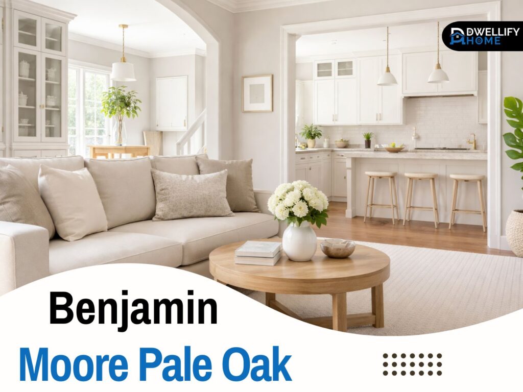
Real-Home Results: What Pale Oak Looks Like on Walls
In bright rooms, Pale Oak often reads as a soft, creamy off-white with depth. It doesn’t look stark, and it doesn’t feel cold. I’ve had clients who wanted a white wall look but didn’t want a sharp contrast with wood floors. Pale Oak gave them that calm lightness, with just enough warmth to feel relaxed.
In medium-light spaces, it shows its greige identity more clearly. You’ll see more of the taupe-gray balance, and it starts to feel like a true neutral backdrop for furniture and art. This is where it shines in open concept homes, because it can flow with both warm and cool accent pieces.
In darker rooms, it can look deeper and sometimes a little dull if there’s no contrast. I’ve seen this happen in basements or rooms with small windows and dark floors. The fix is usually not repainting right away. It’s adding contrast and light support, like brighter trim, better bulb temperature, and lighter textiles. A room can make a paint color look drab, not the other way around.
Also, watch what reflects onto it. Warm hardwood, tan stone, red-toned brick, and even a large warm rug can nudge it warmer. A charcoal sofa, blue wall art, or cool countertops can pull it cooler. Pale Oak is responsive, so it’s smart to consider your fixed finishes first.
Best Rooms to Use Benjamin Moore Pale Oak (Room-by-Room Guide)
Benjamin Moore Pale Oak living room
In living rooms, Pale Oak is a strong choice when you want the space to feel bright but not sterile. I’ve used it in rooms with both warm woods and black accents, and it tends to settle in nicely. It gives you a neutral canvas that doesn’t fight your decor.
A practical tip from my own projects: if your living room has a lot of daylight and you want a more defined greige look, use a slightly warmer white on trim, or add a medium-toned rug. If you go too crisp everywhere, the walls can look closer to off-white than you expected.
Benjamin Moore Pale Oak bedroom
For bedrooms, it’s one of the calmer light neutrals I use. It reads soft and restful, especially with warm whites, oatmeal bedding, and natural wood. In rooms that get cooler light, it still stays welcoming, which is why it’s popular for main bedrooms.
If you like a cozy look, pair it with warm metals like brushed brass and soft textures. If you prefer clean and modern, lean into crisp white trim and a cooler accent color like a muted blue-gray.
Benjamin Moore Pale Oak kitchen (walls vs cabinets)
In kitchens, Pale Oak on walls can work beautifully when you’re trying to bridge warm floors and cooler countertops. It’s especially helpful in kitchens where you need something neutral that doesn’t fight white cabinets or warm wood.
If you’re debating walls versus cabinets, think about contrast. Pale Oak walls with bright white cabinets can look airy and intentional. Pale Oak cabinets can work too, but you’ll want to plan the countertops and backsplash carefully so everything doesn’t blend into one soft beige-gray haze.
Benjamin Moore Pale Oak Cabinets (Kitchens, Built-ins, Vanities)
Benjamin Moore Pale Oak cabinets create a subtle, quieter look. It’s not a high-contrast cabinet color, so it works best when you want the cabinetry to feel soft and timeless rather than bold. I’ve used it successfully on built-ins and vanities where the goal was a gentle, layered neutral.
It’s not my first pick for cabinets in a very low-light kitchen with dark floors, because it can lose its freshness and look heavier. In that situation, I’d rather put Pale Oak on the walls and keep cabinetry lighter or brighter, so the room doesn’t feel muted.
For countertops, it pairs nicely with white quartz, warm white stone looks, and even some marble-look patterns that have beige veining. With busy granite that has a lot of yellow or pink movement, you need to test carefully because the undertones can start echoing each other.
Hardware makes a bigger difference than you’d think. Black hardware can sharpen the look. Brushed nickel keeps it classic. Brass can warm it up, but it has to be the right brass, not overly orange. I often recommend bringing home two hardware samples and checking them against the cabinet sample under your actual kitchen lights.
Finish matters too. Matte looks soft and modern but can show fingerprints. Satin is usually the best everyday choice. Semi-gloss is durable, but it can make the undertone shifts more noticeable because it reflects more light.
Trim, Ceiling & Doors: What to Pair With Pale Oak
Trim is where Pale Oak can either look polished or slightly off. A bright white trim creates clean contrast and helps Pale Oak look fresh and airy. This pairing is helpful in lower-light rooms because it keeps the whole space from looking too blended.
A softer white trim can also work, especially if your floors and furniture are warm. Warm whites help Pale Oak feel cohesive, but you have to avoid going too creamy, or the walls can start looking a little gray by comparison.
Here’s my simple rule from experience: if your trim looks too stark next to Pale Oak, go slightly warmer. If your trim looks creamy and the walls start looking dull or gray, go cleaner and brighter. Also, keep your ceilings in a compatible white, because a mismatched ceiling white can make the walls look wrong even when the wall color is fine.
For doors, you can keep them the same trim white, or go deeper with a contrast color. Pale Oak doesn’t demand a dramatic door color, but it can handle one if your home style supports it.
Coordinating Colors That Make Pale Oak Look Designer-Level
Pale Oak plays nicely with a lot of palettes, but I find it looks best when you choose your supporting colors intentionally instead of grabbing random neutrals. The goal is to create either a clean contrast or a soft blend, not something in-between that feels accidental.
A few dependable directions:
- Crisp whites for trim and ceilings, so the walls stay fresh
- Soft taupes and warm grays for a layered neutral look
- Muted blue-greens for a calm accent, especially in bedrooms and living rooms
- Charcoal or deep gray for grounding, like an island, fireplace surround, or built-in
If your home has warm woods, Pale Oak can be a bridge color. If your home is more modern with cool grays and bright whites, it can still work, but you’ll want to keep your accents slightly warmed up so the walls don’t feel like they’re floating between warm and cool.
Pale Oak Compared: What to Choose If You’re Deciding Between Popular Neutrals
Benjamin Moore Pale Oak vs Edgecomb Gray
This is a common comparison, and the easiest way I explain it is this: Edgecomb Gray tends to read warmer and a bit more beige in many rooms, while Pale Oak is lighter and often feels more balanced between taupe and greige.
If you have a room that already leans warm, Edgecomb Gray can push it too far. Pale Oak often behaves better there. If you have a room that feels cool and you want more warmth, Edgecomb Gray can be the better choice. The right answer depends on your light and fixed finishes, not just the paint chip.
Pale Oak vs Revere Pewter and other close alternatives
Revere Pewter is deeper and more noticeable as a greige. It can feel heavier, which can be great in a bright space but too much in a dim one. Pale Oak stays lighter and more airy, so it’s usually easier in smaller rooms and hallways.
If Pale Oak looks too warm in your home, a nearby alternative is something slightly cooler and grayer. If it looks too gray or dull, a warmer greige or a warmer off-white often solves it. This is also why I like comparing samples side-by-side on the wall, not in your hand.
Best Uses by Surface (Walls vs Trim vs Exterior-Adjacent Spaces)
On walls, Pale Oak is most forgiving in an eggshell finish because it gives a soft, washable surface without highlighting texture. Matte can look beautiful too, especially in bedrooms, but it’s less forgiving with scuffs.
On trim, I usually keep Pale Oak off trim unless the goal is a monochromatic look. Most homes benefit from a cleaner white trim to keep the walls crisp. If you do paint trim in Pale Oak, choose a higher sheen for durability, but expect more light reflection and more undertone movement.
In open concept spaces, Pale Oak works as a linking color. It transitions nicely from living room to kitchen when the cabinets are white or wood, and it doesn’t fight common countertop tones. It can also connect adjacent rooms that have different natural light, which is a big reason people use it as a whole-house neutral.
Sampling & Testing Pale Oak Like a Pro (Avoid Expensive Mistakes)
This is the part I wish more people took seriously, because it saves money and stress. Don’t test Pale Oak as a tiny square. It needs space to show you what it really does.
Test it on at least two walls, ideally one that gets more light and one that gets less. Look at it in the morning, afternoon, and at night. Then look again with your lights on, because many surprises happen after sunset.
Also, compare it next to your fixed finishes. Hold your sample near your flooring, countertops, and cabinets. If your floors are very warm, watch for extra taupe warmth. If your counters are cool, watch for the walls leaning a bit more gray. This isn’t a problem, it’s just information.
One more tip from real projects: your phone camera can exaggerate undertones. Use your eyes first. Photos are useful, but they’re not the final judge.
Common Mistakes (That I See People Make) + Quick Fixes
One mistake is assuming any light greige will behave the same. Pale Oak is soft and responsive, so it will show what’s happening in the room.
If it looks pink or violet, it’s usually reflection from nearby colors, warm stone, red-toned wood, or certain bulbs. Try adjusting bulb temperature, and check what big surfaces are reflecting onto the wall.
If it looks gray or dull, the room may need contrast. Brighter trim, lighter rugs, and better lighting often bring it back to life. In a very dark space, consider whether a brighter off-white is a better fit.
If trim looks wrong, it’s usually a temperature mismatch. A trim that’s too creamy can make Pale Oak look flatter. A trim that’s too icy can pull the gray side forward. This is why trim sampling matters almost as much as wall sampling.
Benjamin Moore Pale Oak Review: Real-World Opinions (Including Reddit-Style Concerns)
When people love Pale Oak, they usually describe it as calm, flexible, and easy to decorate around. It can handle warm woods, it can sit next to white cabinets, and it doesn’t feel trendy. In many homes, it reads like a soft neutral that’s simply there, doing its job.
When people don’t love it, it’s often because the room was low-light and the color felt a bit flat, or because they weren’t expecting the undertone shift in certain lighting. That’s where the Benjamin Moore Pale Oak reddit style conversations tend to land, a mix of people who had it look perfect and others who saw it change more than they expected.
In my experience, Pale Oak works best for homeowners who like subtle neutrals and are willing to sample properly. If you want a neutral that looks identical in every room no matter what, you may be happier with a more straightforward off-white or a slightly deeper greige.
FAQ
What is the undertone of Pale Oak Benjamin Moore?
Pale Oak is a warm taupe-leaning greige. In some homes, it can show a soft pink or violet cast, especially with certain lighting and warm reflective finishes.
What colors go with Pale Oak?
It pairs well with clean whites for trim, warm neutrals for a layered look, and muted blue-greens for calm contrast. Deeper charcoals also work when you want definition.
Is Pale Oak a greige or beige?
It’s best described as a very light greige with a taupe influence. In bright rooms it can look close to off-white, while in dimmer rooms it reads more greige.
What is the Benjamin Moore equivalent to Pale Oak?
Within Benjamin Moore, close “same-family” options people compare to it include Balboa Mist, Classic Gray, and Collingwood. The best match depends on whether you want cooler, warmer, or slightly deeper.
Why does Pale Oak look different in every room?
Direction of light, bulb temperature, and nearby finishes change how undertones show up. That’s why it can feel creamy in one room and more gray-taupe in another.
Conclusion
If you want a light neutral that feels warm, calm, and flexible, Benjamin Moore Pale Oak can be a strong choice, but it’s not a paint-and-forget color. It responds to the room, which is exactly why it can look so natural when it’s right.
My best advice is simple. Sample it in your actual lighting, next to your floors and fixed finishes, and decide your trim color at the same time. Once you see how it behaves in your space, you’ll stop second-guessing and feel confident moving forward.
Disclaimer:
This article is for educational purposes and reflects general color-consulting guidance. Always test paint samples in your space and lighting before purchasing, since screens, bulbs, and surrounding materials can change how any color appears.

I’m Bilal Hassan, the founder of Dwellify Home. With 6 years of practical experience in home remodeling, interior design, and décor consulting, I help people transform their spaces with simple, effective, and affordable ideas. I specialize in offering real-world tips, step-by-step guides, and product recommendations that make home improvement easier and more enjoyable. My mission is to empower homeowners and renters to create functional, beautiful spaces—one thoughtful update at a time.