Picking the right artwork for your living room can feel weirdly stressful. You know what you like, but then you start thinking, Will it be too small? Too bold? Too messy? And suddenly a blank wall feels like a huge decision.
Here’s the thing. Living room art doesn’t have to be complicated. If you understand a few simple rules about style, size, and placement, you can make your space feel finished and personal without overthinking every detail.
I’ve helped homeowners style everything from small apartments to wide open family rooms. The same approach works almost every time: start with your room’s mood, pick the right wall, choose a piece that fits the scale, then hang it at the right height. Let’s walk through it step by step.
Snippet-ready definition:
Art for living room means choosing wall pieces that match your room’s style, scale, and mood, then placing them at the right height so the space feels balanced, finished, and personal.
Mission Statement:
At Dwellify Home, our mission is to make decorating feel simple and doable, with practical, experience-based guidance that helps you create a home that looks good and feels like you.
Quick Guide Table (Comparison + Fast Decisions)
| Goal | Best Choice | Why it works | Quick rule |
| Clean, dramatic look | Large statement piece | Fills blank walls fast, feels intentional | Aim for about two-thirds sofa width |
| Balanced, easy styling | Set of 2 (diptych) | Looks designer, simple to hang | Keep equal spacing, center as one unit |
| Personal, layered wall | Gallery wall | Tells a story, works with mixed frames | Keep spacing consistent |
| Small room that feels busy | One larger piece | Less clutter, more impact | Avoid many tiny frames |
| Low light living room | Lighter art + picture light | Keeps art visible at night | Warm lighting feels softer |
Step-by-step mini guide (Simple and practical)
- Pick the wall first: sofa wall is usually the easiest win.
- Measure your furniture: sofa width matters more than wall width.
- Choose your format: one large piece, set of 2, or gallery wall.
- Use the 2/3 rule: artwork should look about two-thirds the width of the sofa or console.
- Hang at a comfortable height: center near eye level, and keep it visually connected to furniture.
- Check lighting and glare: shift the piece or change glazing if reflections hide it.
Step 1 — Define Your Living Room Style and Mood First
Before you buy anything, decide what you want your living room to feel like. Calm and airy? Cozy and warm? Bold and modern? Art should support that mood, not fight it.
A simple trick I use in real homes is the three word method. Pick three words that describe your space. For example: warm, natural, relaxed. Or modern, crisp, graphic. When you’re choosing wall art for living room modern spaces, those words stop you from grabbing random pieces that look nice alone but clash together.
On top of that, choose whether you want your artwork to blend or contrast. Blending means you pull colors already in the room, like the cream from your rug or the navy from your pillows. Contrasting means you add energy, like a bold abstract over a neutral sofa. Both can look great, but the room feels more intentional when you pick one direction and stick to it.
Step 2 — Choose the Best Wall for Art Placement (Before Buying)
Most living rooms have one wall that naturally wants to be the star. Usually it’s the wall behind the sofa. Sometimes it’s the fireplace wall. In open layouts, it might be the wall you see first when you walk in.
Start by standing at your entry point and notice where your eyes go. That’s the wall where art will make the biggest impact. The best part is, you don’t need art on every wall. One strong focal wall often looks better than four walls that feel busy.
If you have a TV wall, keep it calm. A lot of people try to compete with the TV using heavy decor, and it ends up looking crowded. Instead, place one or two simpler pieces on the side wall, or use a picture ledge with a few larger frames leaned casually.
Renters, don’t worry. You can still get a polished look with removable hooks, rail systems, or leaning large pieces on a console. Just make sure they’re stable and not in a high traffic path.
Step 3 — Pick the Right Type of Art for Your Space
Choosing the type of artwork is where most living rooms either click or feel off. You’re not just picking an image. You’re choosing how the wall will be visually filled.
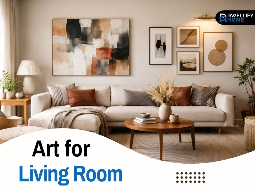
Large statement pieces (Large Wall Art for Living Room)
If you’ve got a big blank wall, a single oversized piece is often the cleanest solution. Large wall art for living room spaces works because it creates one confident moment. It feels like you meant it, not like you were trying to decorate in a hurry.
A real example from a client home: they had a long sectional and a wide wall, but they kept buying medium sized pieces. The wall always looked empty. We switched to one large abstract canvas, and suddenly the whole room felt balanced. The sofa looked anchored, and the wall stopped swallowing the furniture.
If your room is busy with patterns, go for a simpler large piece with strong shapes or soft movement. If the room is plain, the art can do more work, like bold color or dramatic photography.
Sets that look designer fast (Set of 2 or Diptych)
A wall art for living room set of 2 is one of my favorite options for beginners. It’s easier to hang, it feels symmetrical, and it instantly looks polished. This works beautifully above a sofa, above a console table, or on a long hallway style wall in an open living space.
A diptych is great when you want impact but don’t want one huge frame. It also helps if you have narrow stairs or doorways and can’t easily carry a massive canvas into the house. Two pieces can be moved and hung more comfortably.
Triptychs can look amazing too, but only if the wall is wide enough. If the pieces are too small or too close together, the whole thing starts to feel fussy.
Unique wall art that doesn’t feel generic
If you want unique wall art for living room spaces, think beyond standard framed prints. Textured pieces, woven art, carved wood panels, wall sculptures, and mixed media create depth. They also catch light differently, which makes the room feel richer.
Nature inspired prints are another safe, timeless option. Landscapes, botanicals, and abstract nature patterns can bring calm, especially in family rooms where life gets noisy. If you’ve got a lot of hard surfaces like tile, glass, or leather, textured art helps soften the space visually.
Step 4 — Size and Scale Rules That Make Art Look Right
Here’s the thing. The biggest mistake I see is art that’s too small. A tiny frame floating above a large sofa will always look awkward, even if it’s a beautiful piece.
A simple rule that works in most real living rooms: aim for the artwork to be about two thirds the width of the furniture below it. So if your sofa is 90 inches wide, your art or art grouping should look around 60 inches wide. That’s why large modern wall art for living room walls often looks better than smaller pieces. It matches the scale of the furniture.
If you’re decorating a huge blank wall with no furniture below, you have two strong choices. Go oversized with one statement piece, or create a planned arrangement like a gallery wall. What doesn’t work is scattering a few random frames across the wall. That makes the wall feel messy and unfinished.
If you’re unsure about size, try this easy test. Use painter’s tape to outline the size of the artwork on the wall. Live with it for a day. You’ll know quickly if it feels right.
Step 5 — Hanging Height, Spacing, and Layout (No Guesswork)
Hanging art can make people nervous, but the rules are simpler than they seem. In most living rooms, the center of your artwork should sit around eye level for an adult standing. The goal is to avoid art that feels like it’s climbing the wall.
When art goes above a sofa, keep it visually connected to the furniture. A common mistake is leaving a huge gap, which makes the art feel like it belongs to a different room. As a practical range, I usually keep the bottom edge of the frame about a hand span above the sofa, enough to feel intentional but not floating.
If you’re hanging two pieces or a set of 2, treat them like one unit. Measure the full width of both pieces plus spacing, then center that whole group over the sofa.
Gallery wall spacing (simple rule)
Gallery walls look great when spacing is consistent. The biggest secret is not the frames, it’s the rhythm. Choose one spacing distance and stick to it. Most people naturally prefer a clean, even gap rather than a mix of tight and wide gaps.
Also, plan the layout before drilling. Lay the frames on the floor, move them around, take a photo, then transfer it to the wall. That one step saves you from making ten extra holes and getting frustrated.
Gallery Wall for Living Room (Clean, Not Cluttered)
A gallery wall can feel personal and stylish, but it can also look chaotic if you don’t set a simple rule. Start with one unifying element. That might be a consistent frame color, a shared color palette in the artwork, or a theme like black and white photography.
One method I use often is the anchor piece approach. Start with one larger piece in the center, then build outward with smaller frames. This keeps the wall from drifting up or spreading too wide.
Keep your gallery wall to a clear boundary. A lot of people keep adding frames until it spills into corners and doors. Decide your outer edges first, then fill inside that shape. The best part is, a smaller, well planned gallery wall often looks more expensive than a huge messy one.
If you want it extra clean, try a picture ledge instead. You can swap art seasonally, mix frames, and change the look without drilling again.
Color, Pattern, and Matching (So It Feels Cohesive)
If your living room already has a lot going on, like patterned rugs, bold curtains, or textured walls, your art should support the room, not compete with it. In those spaces, I usually recommend calmer artwork with a limited palette, or pieces that repeat one or two colors from the room.
If your room is mostly neutral, art is where you can bring in energy. A colorful abstract, modern line art, or graphic shapes can instantly wake up a beige or gray living room without needing new furniture.
A practical tip that works every time: pull colors from what’s already there. Choose one main color from your rug, one from your pillows, and one neutral. Then look for artwork that includes at least one of those shades. It doesn’t have to match perfectly. It just needs to relate.
Also think about finish and texture. A glossy print feels modern and crisp. A textured canvas feels softer. A matte framed print feels classic. These small choices change the mood more than people expect.
Framing and Finishing Touches That Make Art Look Expensive
Framing is where wall art goes from okay to polished. Even affordable prints can look high end with the right frame and mat.
Black frames feel modern and sharp. Light oak feels warm and natural. White frames feel airy and casual. Metal frames can look sleek, especially in contemporary rooms. If you’re mixing frames, keep one thing consistent, like matching finishes or matching mat color.
Mats are another easy upgrade. A simple mat gives the artwork breathing room and makes it feel intentional. If you’re working with a poster, consider a larger mat to make it feel more like a piece of art, not a quick decoration.
Canvas can look great too, especially for large pieces. If you want a cleaner look, choose a canvas with a thicker profile or a floating frame. That’s a detail that often makes large wall art for living room spaces feel more curated.
Lighting Tips (The Secret to Gallery Level Impact)
Lighting changes how your art looks more than you’d think. A piece that looks perfect in daylight can feel flat at night if the lighting is wrong.
Avoid glare first. If your art is opposite a window, glass can reflect and hide the image. In that case, go for matte finishes or acrylic glazing instead of shiny glass.
If you want a really elevated look, add a picture light above the frame, or use wall sconces nearby. It doesn’t have to be expensive. Even a well placed floor lamp that washes light toward the wall can create that soft gallery feel.
Guess what. Warm bulbs usually flatter art better than harsh cool lighting. They make colors feel richer and skin tones in photos look more natural.
2025–2026 Living Room Art Trends (Use What Fits Your Style)
Trends are helpful when you use them as inspiration, not a rulebook. Right now, a few directions keep showing up in stylish homes.
Oversized statement pieces are still strong, especially in modern spaces. Bold abstract and geometric work is popular because it adds energy without needing a specific subject. Nature inspired prints keep winning because they calm a room and feel timeless.
Textured and mixed media pieces are also growing. Think layered materials, sculptural wall art, and pieces that cast subtle shadows. These add depth, especially in rooms that feel flat.
Another trend I love is the seasonal refresh. Instead of buying new decor every year, rotate a few pieces. Swap one print, move a frame from the hallway to the living room, or change out a gallery ledge arrangement. It keeps your home feeling fresh without a full redesign.
Where to Shop Wall Art for Living Room (And How to Buy Smart)
When you shop wall art for living room spaces, the biggest thing to get right is size. People often fall in love with a design and ignore measurements. Then it arrives and feels tiny. Always check the size first, then pick the design.
If you’re on a budget, prints plus good framing can look amazing. Mid range options like limited edition prints can give you something more special. If you want a truly personal piece, local artists or commissions can create that one of a kind feel, especially if you’re aiming for large unique wall art for living room walls.
Before you buy, use this quick checklist:
- Confirm the exact dimensions and orientation
- Check material details, like canvas, paper type, or texture
- Review return policy and shipping protection
- Look at real customer photos if available
That last one matters. Real photos show true colors and scale.
Real Life Expert Tips (Small Rooms, Kids, Pets, Sunlight)
Small living rooms don’t need small art. In fact, fewer larger pieces often look cleaner and make the room feel bigger. Too many tiny frames can look like clutter, especially in tight spaces.
If you’ve got kids or pets, choose sturdy hanging hardware and avoid fragile glass in high traffic areas. Acrylic glazing is lighter and safer, and it still looks clear. Also, don’t place valuable originals where toys or tails can reach easily.
Sunlight is another real issue. Direct sun can fade prints over time. If your living room gets strong daylight, consider rotating pieces seasonally or using UV protective glazing. Even moving art a few feet away from a bright window can help.
One more tip from experience: if your walls are textured, use proper anchors. Art that slowly tilts forward on a textured wall can drive you crazy.
Common Mistakes (And Quick Fixes)
Let’s make this easy. Here are the big mistakes I see, plus quick fixes that work.
- Art is too small
Fix: go larger, or choose a set of 2 that fills the width above furniture. - Art is hung too high
Fix: lower it so it feels connected to the sofa or console. - Too many small frames scattered
Fix: group them into a planned gallery wall with consistent spacing. - No link to the room’s colors
Fix: pick art that repeats at least one color already in your rug, pillows, or curtains. - Overdecorating every wall
Fix: let one wall be the hero. Keep the others calm.
The best part is, most of these fixes don’t require buying new art. Often it’s just changing placement or simplifying the arrangement.
Quick Room by Room Placement Ideas (Optional but Useful)
If you want a fast starting point, these placements work in most homes.
- Above the sofa: one large piece or a diptych centered and visually connected
- Above a mantel: keep the art centered and not taller than the mantel area feels comfortable
- Next to a TV wall: use one calm piece to balance the screen without competing
- Behind a reading chair: medium to large art helps define a cozy corner
Pick one of these zones first. Styling is easier when you focus on one wall at a time.
FAQs
What size wall art works best above a sofa?
Aim for a piece or grouping that’s about two thirds the sofa’s width. It usually looks balanced and intentional.
How high should I hang living room art?
Keep the center around eye level. Above a sofa, keep the bottom close enough that it feels connected to the furniture.
Is a set of 2 better than one large piece?
A set of 2 is easier to balance and looks polished fast. One large piece is cleaner and more dramatic. Choose based on wall size and your style.
What’s the easiest way to start a gallery wall?
Start with one anchor piece, plan the outer boundary, and keep spacing consistent. Don’t wing it on the wall.
Conclusion (Art for Living Room)
If your living room feels unfinished, it’s usually not because you need more decor. It’s because the wall art doesn’t match the scale, placement, or mood of the room yet.
Start simple. Choose one wall, decide the mood, and pick a piece that fits the width of the furniture below it. Hang it at a comfortable height, then adjust the lighting so it looks good day and night. Once that first wall looks right, everything else becomes easier.
And remember, the goal isn’t to create a showroom. It’s to make your living room feel like you live there, love it there, and feel proud when someone walks in. That’s what great wall art does.
Disclaimer:
This guide shares general styling advice for typical living rooms. Results can vary based on wall type, furniture layout, and lighting. Always use appropriate hardware and anchors for your wall material, and prioritize safety when hanging heavy frames.

I’m Bilal, the founder of Dwellify Home. With 6 years of practical experience in home remodeling, interior design, and décor consulting, I help people transform their spaces with simple, effective, and affordable ideas. I specialize in offering real-world tips, step-by-step guides, and product recommendations that make home improvement easier and more enjoyable. My mission is to empower homeowners and renters to create functional, beautiful spaces—one thoughtful update at a time.