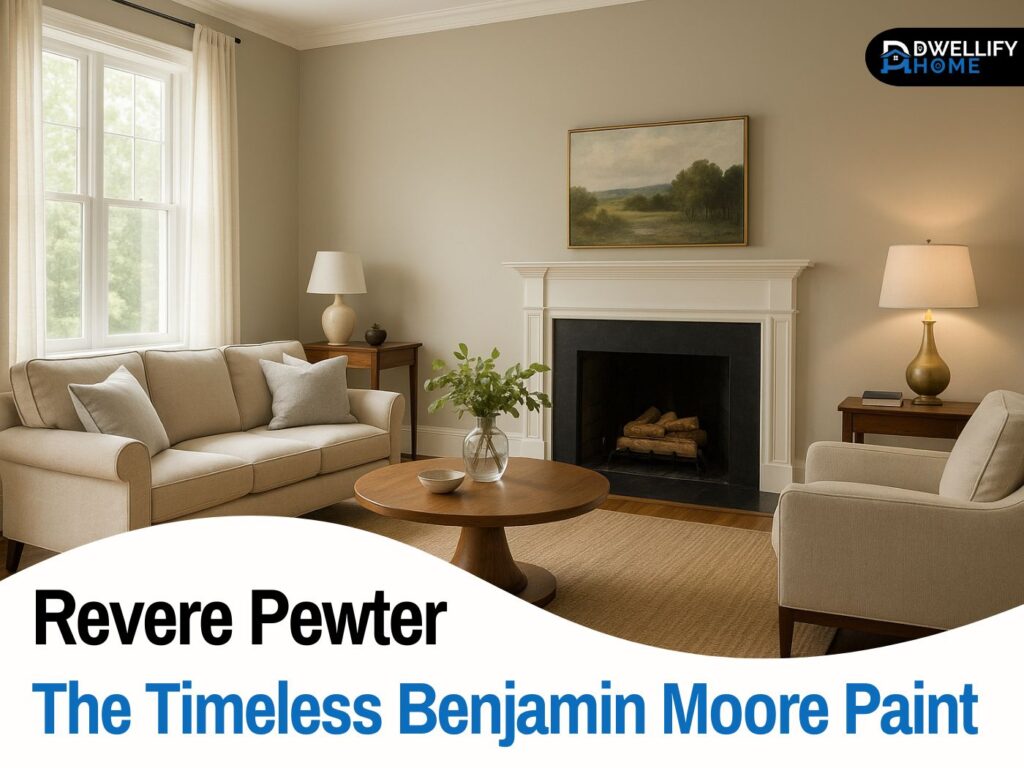
If you’ve been eyeing sea salt sherwin williams, you’re not alone. It’s one of those paint colors people fall in love with online… and then get confused the moment it hits a real wall. Here’s the thing: Sea Salt isn’t a “one-look” color. It shifts based on light, direction, and the finishes you already have in your home.
I’ve used Sea Salt in bedrooms, bathrooms, living rooms, and coastal-inspired spaces for years, and I can tell you this: when it’s right, it feels calm and airy like a soft exhale. But if you ignore undertones or lighting, it can turn cooler, grayer, or even a little “blah.”
So let’s walk through it like we’re standing in your hallway with paint samples in hand. I’ll show you how it behaves, where it shines, what to pair it with, and the common mistakes that make people regret it.
Snippet-ready definition:
Sea Salt by Sherwin-Williams (SW 6204) is a soft blue-green with gray undertones. It looks airy and spa-like, but shifts with lighting—sometimes greener, sometimes bluer, and occasionally grayer.
Mission Statement:
At Dwellify Home, our mission is to make real-life decorating decisions easier—sharing clear, experience-based guidance so you can choose colors and finishes with confidence (and fewer costly do-overs).
What Color Is Sea Salt (SW 6204)?
Sea Salt is best described as a soft blue-green with a gray base. It’s not a bold color statement, and it’s not a plain neutral either. It lives in that sweet spot where a room feels gently colored but still light and livable.
The best part is it can work with a lot of styles. I’ve seen it look coastal with woven textures and white trim, modern with crisp accents, and even slightly traditional when paired with warm whites and natural wood.
Sea Salt at a glance (quick facts)
- Color family: blue-green/green-gray
- Vibe: calm, clean, spa-like, airy
- Personality: a “chameleon” that changes with lighting and nearby finishes
If you want a color that feels peaceful without screaming “I painted the room green,” Sea Salt is often a solid candidate.
Quick Guide Table (Comparison + “pick the right one”)
| Color | What it usually looks like | Best when you want… | Common “watch-out” |
| Sea Salt (SW 6204) | Blue-green/green-gray that shifts | Calm, coastal, spa vibe; light + airy rooms | Can go cooler/bluer in north light; can look grayer at night |
| Rainwashed (SW) | More noticeable blue-green | A bit more color “presence” than Sea Salt | Can feel too colorful if you wanted a near-neutral |
| Comfort Gray (SW) | Deeper, more grounded blue-green | More depth; slightly moodier rooms | Might feel heavier than expected in small/dark rooms |
| Silver Strand / Oyster Bay (SW) | Cooler/gray-forward coastal tones | More modern, smoky look | Can read chilly if your home is warm-toned |
Step-by-step sampling guide (fast + foolproof)
- Sample BIG: at least 2–3 ft wide on two walls (one bright, one shadowy).
- Check it 3 times: morning, late afternoon, and night (lights on).
- Compare next to fixed finishes: floors, counters, tile, and your trim white.
- Decide trim first: crisp vs soft white changes how Sea Salt reads.
Sea Salt Undertones Explained (Green vs Blue vs Gray)
Undertones are what make people either love Sea Salt or feel totally tricked by it. On the paint chip, Sea Salt often looks like a soft minty-blue. But on walls, you’ll usually see three undertones taking turns: green, blue, and gray.
Guess what? The gray base is what keeps it from feeling too bright or childish. That’s why it works in grown-up spaces. But it’s also why it can sometimes read “cooler” than people expect.
When Sea Salt looks more blue vs more green
In my experience, Sea Salt leans more blue when:
- The room has cool daylight (like north-facing light)
- You’ve got white tile, cool gray counters, or chrome finishes
- There’s less warm wood or beige in the space
It leans more green when:
- The room has warmer light (afternoon sun or warm bulbs)
- You’ve got warm white trim, creamy stone, or tan-beige elements
- You pair it with warm metals like brass
So before you commit, you don’t just ask “Do I like Sea Salt?” You ask, “Which version of Sea Salt will my room pull out?”
Sea Salt LRV and Brightness
LRV (Light Reflectance Value) is basically how much light a color reflects. Sea Salt is considered light, so it tends to brighten spaces compared to deeper greens or grays. That’s why it’s so popular in bathrooms and bedrooms.
On top of that, the higher LRV makes it forgiving in smaller rooms. But there’s a catch: in very bright rooms, Sea Salt can look even lighter than expected, sometimes almost like a tinted off-white.
Easy rule for bright rooms vs dim rooms
Here’s my simple rule of thumb:
- Bright rooms: Sea Salt looks airier, fresher, and sometimes a bit more blue-green.
- Dim rooms: It can look grayer and cooler, especially at night under artificial light.
If your room doesn’t get much daylight, you’ll want to be extra thoughtful about trim color and lighting temperature. That’s where the magic (or the regret) usually happens.
Is Sea Salt Warm or Cool?
Sea Salt is generally cool-leaning. Not icy, not sterile… but it’s not a warm creamy color either. That coolness is what makes it feel crisp and spa-like in so many homes.
That said, it can feel softer and slightly warmer when the room has warm elements—like honey oak floors, warm white trim, or warm bulbs. So it’s not “cold,” but it can become chilly if everything else in the space is already cool-toned.
If you’re someone who loves cozy warmth, you can still use Sea Salt. You’ll just want to balance it with warmer partners (we’ll get to those in coordinating colors).
How Lighting Changes Sea Salt (Most Important Section)
If you take nothing else from this guide, take this: Sea Salt is a lighting color. I’ve seen it look dreamy in one home and disappointing in another—same paint, different light.
When I’m helping homeowners, I always say: don’t judge Sea Salt at 10 a.m. and decide. You need to see it through a full day.
Natural light (window direction + time of day)
- North-facing rooms: usually pull the cooler, grayer side. Sea Salt can look more like a soft blue-gray here.
- South-facing rooms: tend to warm it up and brighten it. It often looks lighter and more balanced.
- East-facing rooms: can look fresh and slightly greener in the morning, then calm down later.
- West-facing rooms: may look warmer late afternoon, and sometimes a bit more “green” as sunlight intensifies.
If your space is north-facing and already feels cool, I often recommend pairing Sea Salt with warmer trim and warm textures so it doesn’t feel flat.
Artificial light (bulb warmth + Kelvin)
At night, light bulbs can totally change the story.
In real homes, I’ve noticed:
- Warm bulbs can pull out the green and make it feel slightly muted or “smokier.”
- Cool bulbs can emphasize the gray/blue and make it feel cleaner—but sometimes too cool.
If you want Sea Salt to feel inviting at night, aim for lighting that doesn’t fight it. And if you’re unsure, this is why sampling matters so much.
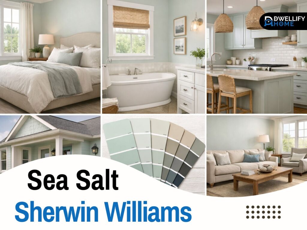
Best Rooms for Sea Salt (Where It Looks Its Best)
Sea Salt is one of those colors that can work in many places, but it really shines in rooms where you want calm. I’ve personally had the best “wow” reactions from homeowners when we used it in restful spaces and paired it correctly.
Sea salt sherwin williams bedroom
For a bedroom, Sea Salt is soothing without being dull. It’s especially beautiful with:
- soft white bedding
- warm wood furniture
- linen textures and natural rugs
If you want your bedroom to feel like a quiet retreat, Sea Salt can do that easily. Just avoid super cool gray carpets and bright white LEDs, because that combo can push it too chilly.
Sea salt sherwin williams bathroom
This is where Sea Salt often feels like it was made to live. It gives that clean, spa bathroom vibe—especially with white tile and simple finishes.
A practical tip: if your bathroom has no window, don’t automatically abandon Sea Salt. Just choose the right trim white and avoid very cool bulbs so it doesn’t turn gloomy.
Sea salt sherwin williams living room
In a living room, Sea Salt works best when you treat it like a soft neutral—not a “color theme.” It pairs well with creamy whites, warm woods, and textured decor.
I love it in open living spaces where you want light, calm walls that don’t overpower your furniture. The best part is it plays nicely with natural light when you keep the room’s other elements balanced.
Sea salt sherwin williams kitchen
Sea Salt in a kitchen can look fresh and clean, especially with white or light countertops. It’s also lovely as a wall color when cabinets are white or wood-toned.
One honest warning: busy granite or very yellow-beige stone can make Sea Salt look a bit off. If your counters have strong warm movement, you’ll want to sample carefully.
Sea salt sherwin williams nursery
Sea Salt is a great nursery color because it doesn’t scream “baby.” It’s soft, calm, and timeless.
If you want it to feel warm and cozy, add natural wood, warm textiles, and a softer white trim. That combination keeps it sweet without looking themed.
Sea Salt on Cabinets (Read This Before You Commit)
Let’s talk about sea salt sherwin williams cabinets, because cabinets are a bigger commitment than walls. Cabinets show more shadows, more angles, and more “true undertone” than a flat wall does.
I’ve seen Sea Salt work beautifully on:
- bathroom vanity cabinets
- built-ins and bookcases
- kitchen islands (especially two-tone kitchens)
Where people get stuck is using it on every kitchen cabinet and expecting it to feel crisp. Sometimes it does. But sometimes, it feels a little too soft and low-contrast unless your counters, backsplash, and lighting support it.
Sea salt sherwin williams cabinets — best use cases
If you’re nervous, start with a safer application:
- an island
- pantry door
- lower cabinets only
- a powder room vanity
That gives you the charm without committing your whole kitchen.
Hardware + counter pairing shortcuts
Here’s what usually works best:
- Chrome or brushed nickel: keeps it fresh and clean
- Brass: warms it up and feels classic/coastal
- White quartz counters: a safe, crisp pairing
- Very warm beige counters: sample carefully (they can push the green)
If you want that “designer look,” don’t just pick hardware you like. Pick hardware that supports the undertone you want Sea Salt to show.
Sea Salt Coordinating Colors (3 Easy Palette Directions)
Most people searching sea salt sherwin williams coordinating colors want one thing: a palette that feels intentional. And honestly, Sea Salt pairs best when you choose a direction and stick with it.
1) Soft tonal palette (calm + cohesive)
This is the easiest route if you want a peaceful home. Think soft whites, light greiges, and gentle blue-green accents.
This palette works really well in bedrooms, nurseries, and bathrooms where calm matters more than contrast.
2) Warm-balanced palette (cozy but still fresh)
If your home has warm wood floors, beige stone, or creamy furniture, this is your path. Pair Sea Salt with warmer whites and sandy neutrals so it feels welcoming.
Here’s the thing: warm balance keeps Sea Salt from drifting too cool, especially in low-light spaces.
3) High-contrast palette (modern + grounded)
If you like a sharper, more modern look, add contrast. Deep charcoals, near-black accents, or a rich navy can make Sea Salt feel more polished.
This works well in living rooms and exteriors where you want Sea Salt to look “designed,” not just “painted.”
Best White Trim Colors for Sea Salt
Trim color matters more than most people realize. Sea Salt can look cleaner, softer, or slightly grayer depending on the white you put next to it.
If you go too bright and crisp, Sea Salt may look more gray. If you go too creamy, it can pull a bit greener. So the trim choice should match your home’s fixed elements and lighting.
Crisp white vs soft white — how to choose
- Go crisp if your home has cool finishes (cool tile, modern counters, cleaner daylight).
- Go soft if your home has warm wood, beige stone, or you want a cozier feel.
A quick personal tip: when homeowners are unsure, I often test a crisp white and a soft white on the same wall next to Sea Salt. It becomes obvious within 24 hours which one feels right.
Sea Salt vs Similar Paint Colors (So You Don’t Choose the Wrong One)
Sea Salt is popular, but it’s not the only color in this family. If you’re debating between a few options, these quick comparisons can save you a lot of second-guessing.
Sea Salt vs Rainwashed
Rainwashed typically feels a bit more “colorful” and noticeable. If Sea Salt feels too quiet for you, Rainwashed may give you a little more presence.
Sea Salt vs Comfort Gray
Comfort Gray usually reads deeper and moodier. If you want something with more depth or you’re painting a larger space and want more color weight, Comfort Gray may be better.
Sea Salt vs Silver Strand / Oyster Bay (when you want more depth)
These options often feel cooler and more gray-forward. If you love the calm look but want a more modern, grayed-out vibe, they’re worth sampling.
My honest advice: don’t pick these based on online photos alone. Pick them based on how they behave in your exact light.
Sea Salt on the Exterior (Smart Ways to Use It)
Yes, sea salt sherwin williams exterior use can work—but it’s usually best when you use it strategically. Outside light is intense, and undertones show up differently than indoors.
I’ve seen Sea Salt used successfully on:
- front doors
- shutters
- porch ceilings
- exterior accents
Full siding is possible, but you’ll want to test it carefully because outdoor shade can pull it cooler and more gray.
Best exterior placements
If you want the safest win, start with an accent (door or porch ceiling). That gives you the charm without risking a full-house surprise.
Exterior pairing shortcuts
For most homes, Sea Salt looks best with:
- a clean, bright trim color
- darker accents for balance (like charcoal or deep navy)
- natural stone/brick that doesn’t lean too orange
If your exterior has very warm brick, Sea Salt can still work—but sampling is non-negotiable.
Where Sea Salt Can Go Wrong (And How to Avoid It)
This is the part that saves people money and frustration.
Sea Salt can disappoint when:
- the room is very dark and you expected “fresh and airy”
- you’ve got orange-toned wood everywhere and no balancing neutrals
- your lighting is too cool, making it feel chilly
- your trim is mismatched, causing the color to look “off”
Avoid these common “Sea Salt problems”
If you’re worried about a mismatch, try this:
- Warm up the space with textiles, warm whites, and wood tones
- Use lighting that doesn’t exaggerate coolness
- Sample next to your fixed elements (tile, counters, floors)
Sea Salt is beautiful, but it’s not magic. It needs the right supporting cast.
Pro Tips for Getting Sea Salt Right (Sampling + Finish)
After a decade of testing paint colors in real homes, I’ll say it plainly: sampling is the difference between loving Sea Salt and ripping it out.
Don’t sample a tiny square and call it a day. Sea Salt changes as you move through the room, and the only way to see that is with a proper test.
The 3-step sample test (morning, afternoon, night)
Here’s my go-to method:
- Paint a large sample on two different walls (especially one with less light)
- Check it in morning, late afternoon, and night
- Look at it next to your trim and biggest fixed finish (floor, counter, tile)
If you can, view it from the doorway too. That’s how you’ll see the “overall read,” not just the close-up color.
Best sheen by room (simple guidance)
Keep it simple:
- Bedrooms/living rooms: matte or eggshell (soft, forgiving)
- Bathrooms/kitchens: eggshell or satin (easy to clean)
- Cabinets: satin or semi-gloss depending on your preference and durability needs
A small sheen change can make Sea Salt look slightly richer or slightly flatter, so it’s worth considering.
Whole-House Strategy (Optional but High Value)
If you’re thinking of using Sea Salt beyond one room, the easiest way to avoid a mismatched home is a simple 60/30/10 approach.
A simple 60/30/10 plan using Sea Salt
- 60%: your main neutral (walls in main areas or connecting halls)
- 30%: a supporting neutral or soft partner color (bedrooms, secondary spaces)
- 10%: accent colors (pillows, rugs, art, a door, or cabinetry)
Sea Salt often works best as part of the 30%—meaning it’s used where calm matters, while a more neutral base keeps the whole house cohesive.
FAQs
1) Is Sherwin Williams Sea Salt blue or green?
It’s both—a soft blue-green with a gray base. In cooler/north light it can flash bluer; in warmer light it can lean greener.
2) What colors go well with sea salt?
The safest pairings are soft whites, light greiges, sandy neutrals, and then a deep navy/charcoal for contrast. Choose based on whether your home leans warm or cool.
3) Does sea salt look gray?
Yes, especially in low light or at night. The gray base is part of why it feels calm and neutral, but it can look more gray in darker rooms.
4) What undertones does SW sea salt have?
Sea Salt has green, blue, and gray undertones. The balance shifts depending on exposure and surrounding finishes.
5) What’s the easiest way to avoid “surprise” results with Sea Salt?
Don’t choose it from a chip. Sample it large, view it over a full day, and test it next to your trim and biggest fixed surface (floor/counter/tile).
Conclusion
If you want a paint color that feels calm, clean, and quietly beautiful, sea salt sherwin williams is a strong option—especially in bedrooms, bathrooms, nurseries, and relaxed living spaces. But it’s a “real home” color, not a paint-chip color. It needs your lighting, trim, and finishes to cooperate.
Here’s the practical takeaway I give homeowners: sample it big, watch it all day, and choose trim with intention. When you do that, Sea Salt stops being unpredictable and starts feeling like the perfect soft backdrop—one you’ll enjoy for years.
Disclaimer:
Paint colors can look different on screens and in different lighting conditions. Always test a large sample in your space before painting, and consider professional guidance for complex or whole-home color planning.

I’m Bilal, the founder of Dwellify Home. With 6 years of practical experience in home remodeling, interior design, and décor consulting, I help people transform their spaces with simple, effective, and affordable ideas. I specialize in offering real-world tips, step-by-step guides, and product recommendations that make home improvement easier and more enjoyable. My mission is to empower homeowners and renters to create functional, beautiful spaces—one thoughtful update at a time.