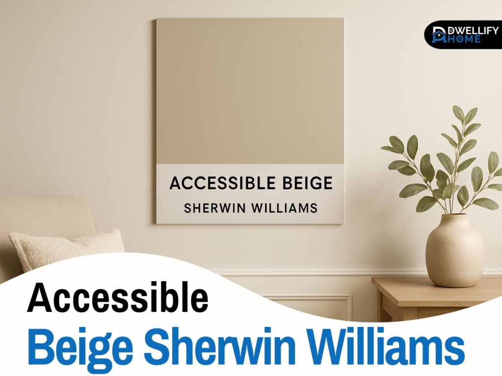
When someone asks me for a warm neutral that feels calm, clean and versatile without leaning yellow or gray, I often smile and say, “Have you tried Accessible Beige?” It’s one of those Sherwin Williams shades that looks simple at first glance but behaves beautifully in real homes. If you want a color that works on walls, cabinets and even exteriors, this one deserves your attention.
Let me walk you through it just like I would if we were sitting at your dining table, looking at paint samples together. I’ve used Accessible Beige in many real projects, so everything here comes from experience plus what works best in modern homes.
Snippet-Ready Definition:
Accessible Beige Sherwin Williams is a warm greige paint color known for its soft taupe and gray undertones. It works beautifully in living rooms, bedrooms, kitchens and even exteriors thanks to its balanced, natural warmth.
Mission Statement:
Our mission is to guide homeowners with honest, experience-based advice that makes choosing the right paint colors simple and stress-free. We aim to share practical insights that help you create warm, beautiful and timeless spaces with confidence.
Introduction: Why Accessible Beige Sherwin Williams Is So Popular
Most people want a color that feels warm but not outdated. They want something that still looks modern next to white trim, black hardware, wood floors or even gray furniture. Accessible Beige Sherwin Williams SW 7036 hits that sweet spot perfectly. It’s a warm neutral with a soft greige vibe, so it never feels harsh or yellow.
On top of that, homeowners love that it works anywhere. Whether it’s a bedroom, living room, bathroom or even a whole-house palette, the color stays balanced. And guess what. It even looks great on cabinets, doors and exterior siding when paired with the right materials. That’s why so many designers recommend it as a safe, flexible and home-friendly shade.
Accessible Beige Quick Guide
| Feature | Details |
| Paint Code | SW 7036 |
| Color Family | Warm Greige (Beige + Gray blend) |
| Undertones | Soft gray, taupe and slight green grounding |
| LRV | 58 medium-light, reflects good light |
| Best Rooms | Living rooms, bedrooms, bathrooms, kitchens |
| Good With | Wood tones, Pure White, black accents, natural textures |
| Vibe | Warm, calm, clean, modern-neutral |
| Pairs Well With | Agreeable Gray, Evergreen Fog, Iron Ore, Alabaster |
Mini Guide: How to Know if Accessible Beige Is Right for Your Home
A quick checklist you can use.
- You want a warm color that’s not yellow.
- You have warm floors or natural wood furniture.
- You prefer a soft neutral that works with both modern and classic decor.
- You need one whole-house color that stays balanced in different lighting.
- You want a color that pairs well with whites, greens and grays.
What Is Accessible Beige Sherwin Williams SW 7036
Undertones and Color Family
Accessible Beige is officially considered a warm greige. That means it sits right between beige and soft gray. What makes it special is its subtle undertone mix. Instead of the heavy yellow that most old-school beiges had, this one carries taupe and gentle gray undertones with the slightest whisper of green that helps it stay grounded.
The result is a color that feels earthy and natural. In real homes, it never screams for attention, but it also doesn’t wash out. I’ve used it in spaces with heavy natural light and in cozy darker rooms, and it adapts beautifully without becoming muddy or flat.
LRV, Code and Technical Details
If you like understanding the science behind color, here’s what matters. Accessible Beige Sherwin Williams has an LRV of 58, which puts it in the medium-light range. That means it reflects a fair amount of light without feeling too bright. It stays comfortable, warm and easy on the eyes in most lighting setups.
Its official number is Sherwin Williams 7036 and its internal code positions it among their most popular neutral families. The RGB and HEX values lean into warm neutrality, which is why it stays consistent on walls. These details help designers predict how it will react in different environments before we even start testing samples.
Is Accessible Beige Warm or Cool in Real Homes
How Accessible Beige Changes in Different Light
Here’s an important thing I always tell clients. Accessible Beige isn’t a one-note color. It shifts a bit depending on the light in your home.
- North-facing rooms: It leans a little grayer and cooler.
- South-facing rooms: It picks up warmth and feels softer and cozier.
- East-facing rooms: Morning light gives it a warm glow.
- West-facing rooms: Sunset light can make it appear warmer or slightly deeper.
When I used it in a client’s open-concept living room with large west-facing windows, the shade felt warm and welcoming in the evenings. In another project with low natural light, it still held its structure and didn’t turn orange or dull. That’s one of its biggest strengths.
Where to Use Accessible Beige Inside the Home
Living Rooms and Open-Concept Spaces
Accessible Beige is a go-to choice for big open spaces. It works well with wood flooring, light sofas, black hardware and natural decor like jute or rattan. Because it’s a warm greige, it helps create a cohesive flow from room to room without feeling monotonous.
In large open-concept homes, I often pair it with crisp white trim like SW Pure White. It helps the walls feel soft while giving the overall space a clean, finished look.
Accessible Beige Sherwin Williams Bedroom Ideas
If you want a bedroom that feels peaceful, Accessible Beige is perfect. It pairs beautifully with warm woods, soft linens, beige or gray bedding and even black metal accents. In bedrooms with low light, it brings gentle warmth without turning yellow. In brighter bedrooms, it looks clean and airy.
One of my favorite tips is to add a muted green or charcoal accent wall if you want depth without overpowering the space. It looks amazing next to Accessible Beige.
Accessible Beige Sherwin Williams Bathroom Tips
Bathrooms can be tricky because lighting is often cooler or uneven. The good news is that Accessible Beige stays smooth and neutral. It works with white tiles, marble countertops, black fixtures and even warm brass finishes.
Just make sure your lighting isn’t overly blue. A slightly warmer bulb helps the color maintain its natural balance. I’ve used it for powder rooms many times, especially when clients want a soft, spa-like look.
Accessible Beige Sherwin Williams Cabinets, Trim and Doors
Kitchen and Bathroom Cabinets
Using Accessible Beige on cabinets has become a huge trend because it adds warmth without going too dark. It works beautifully with white quartz countertops, marble patterns and brushed nickel or black handles. If you have wood floors, this shade blends in naturally instead of clashing with the wood tone.
One trick I use is painting only the lower cabinets Accessible Beige and keeping uppers white. It creates contrast while keeping the kitchen fresh and modern.
Interior Doors, Trim and Built-Ins
Painting interior doors Accessible Beige is one of my secret favorite design tricks. Against white walls, it looks custom and high-end. Built-in bookshelves or mudroom storage in this color also feel cozy and designer-friendly.
If you’re pairing it with white trim, choose clean whites like Pure White or Alabaster. Creamy whites sometimes clash and make Accessible Beige feel dusty.
Accessible Beige Sherwin Williams Exterior Guide
Siding, Stucco and Brick
Yes, you can use Accessible Beige on your exterior! In fact, it’s a fantastic exterior choice because it doesn’t blow out in direct sunlight. It looks warm, inviting and timeless on siding, stucco and even brick.
It pairs well with roofs that have warm undertones. If your roof is cool gray, the contrast might be too sharp. But with brown, taupe or dark charcoal roofs, it looks completely seamless.
Front Door, Garage Door and Trim Ideas
If you’re using Accessible Beige on the exterior walls, consider bold accents on the doors. Deep charcoal, rich black, navy or walnut-stained wood look incredible next to this shade.
Garage doors in Accessible Beige with black trim or black hardware create a modern but homey vibe. Shutters in Iron Ore or Urbane Bronze can also add the perfect touch of depth.
Colors That Go With Accessible Beige: Easy Palettes That Work
Best White Trim and Ceiling Colors
Here are the whites that work best with Accessible Beige:
- SW Pure White: Clean and modern
- SW Alabaster: Soft and warm but still fresh
- BM White Dove: Timeless and smooth
Avoid whites that lean too creamy. They can make the beige look dirty by comparison.
Accent and Coordinating Colors
Accessible Beige is one of those neutrals that loves friends. Here are colors that coordinate beautifully:
- Soft grays like Mindful Gray or Repose Gray
- Charcoal accents like Iron Ore
- Muted greens and sage tones
- Navy blue
- Terracotta or clay accents for warmth
If you have Accessible Beige cabinets, pair them with whites and grays to keep the palette grounded.
Styling Accessible Beige With Floors, Countertops and Decor
Wood floors play a big role in how Accessible Beige looks. Medium oak, light walnut and warm brown floors blend beautifully. Floors that lean orange can shift the undertone slightly warmer, so use white or charcoal decor to balance it.
For countertops, white quartz, marble patterns or light granite look fantastic. Black hardware, linen fabrics, neutral rugs and matte brass lights all complement the color in a very stylish way.
Accessible Beige Vs Agreeable Gray and Other Neutrals
Quick Comparison of Undertones and LRV
Accessible Beige is warmer and earthier. Agreeable Gray is a softer greige with cooler undertones. If your home has warm wood floors, Accessible Beige usually wins. If your home has cool gray floors, Agreeable Gray may feel more balanced.
When to Choose Accessible Beige vs Agreeable Gray
Choose Accessible Beige if:
- You love warm, earthy tones.
- You have warm floors or furniture.
- You want a cozy and natural look.
Choose Agreeable Gray if:
- Your flooring leans cool gray.
- You prefer a fresher, slightly cooler vibe.
- You want a more modern gray feeling.
Accessible Beige Sherwin-Williams Price, Samples and Testing Tips
Price, Paint Lines and Finish Options
Sherwin Williams typically prices this shade similarly to its other premium lines. The final cost depends on which paint line you choose and if there’s a sale going on. You can get it in interior or exterior formulas, which is great if you want consistency across your whole home.
How to Sample Accessible Beige the Right Way
Always test at least two large samples on different walls. Look at them in the morning and evening. Place them next to your flooring, cabinets and countertops so you’re seeing them in the right context. This one step saves clients so much regret later.
Common Mistakes and Expert Tips With Accessible Beige
A few mistakes I’ve seen over the years:
- Pairing it with creamy yellow trim makes everything look older.
- Using it in a dark room without contrast can make the space feel flat.
- Combining it with cool gray floors sometimes clashes with its warmth.
- Painting everything Accessible Beige without texture looks dull.
Always balance it with clean whites, textures, wood accents or deeper colors to let it shine.
FAQs About Accessible Beige Sherwin Williams SW 7036
Is Accessible Beige still in style
Yes, it’s one of the most popular warm neutrals because it looks modern and natural.
Does Accessible Beige work with gray floors
It can, but only if the gray isn’t too cold. Pair it with warm decor to bridge the tones.
Is Accessible Beige a good whole-house color
Absolutely. Its balanced undertone makes it easy to use from room to room.
Does Accessible Beige look good in small rooms
Yes. It keeps small spaces warm without making them feel closed in.
How is Accessible Beige different from Agreeable Gray
Accessible Beige is warmer and earthier. Agreeable Gray leans cooler and more modern.
What is the undertone of Accessible Beige
Accessible Beige has warm taupe and gray undertones with a slight green grounding. These undertones keep it from looking yellow and help it stay calm and modern in real homes.
Do Evergreen Fog and Accessible Beige go together
Yes, they look beautiful together. Evergreen Fog brings a soft green depth that complements Accessible Beige’s warm greige base. Use Accessible Beige on the walls and Evergreen Fog for an accent wall or cabinetry.
Does Accessible Beige look dated
Not at all. Unlike older beiges, Accessible Beige stays modern because its undertones are muted and balanced. It works with current design trends like black hardware, white trim and natural materials.
Does Accessible Beige go with everything
It goes with almost everything thanks to its neutral greige composition. It pairs well with wood tones, white cabinets, dark accents, natural decor, earthy greens and even certain cool grays.
Conclusion: Is Accessible Beige the Right Neutral for Your Home
If you want a warm neutral that never feels outdated, Accessible Beige Sherwin Williams is one of the safest and most dependable choices you can make. It blends beautifully with wood tones, white trim and natural textures. It works on walls, cabinets and exteriors without losing its balance. The best part is that it adapts to so many styles, whether you love modern simplicity, farmhouse comfort or timeless classic design.
Before choosing any final color, always test it in your own lighting and next to your own materials. But if you’re looking for a warm greige that feels cozy, versatile and elegant in real homes, Accessible Beige SW 7036 is definitely worth trying.
Disclaimer
This article is based on general design knowledge and personal experience using Accessible Beige Sherwin Williams in real home projects. Always test paint colors in your own lighting and next to your own materials before making a final decision.

I’m Bilal, the founder of Dwellify Home. With 6 years of practical experience in home remodeling, interior design, and décor consulting, I help people transform their spaces with simple, effective, and affordable ideas. I specialize in offering real-world tips, step-by-step guides, and product recommendations that make home improvement easier and more enjoyable. My mission is to empower homeowners and renters to create functional, beautiful spaces—one thoughtful update at a time.


