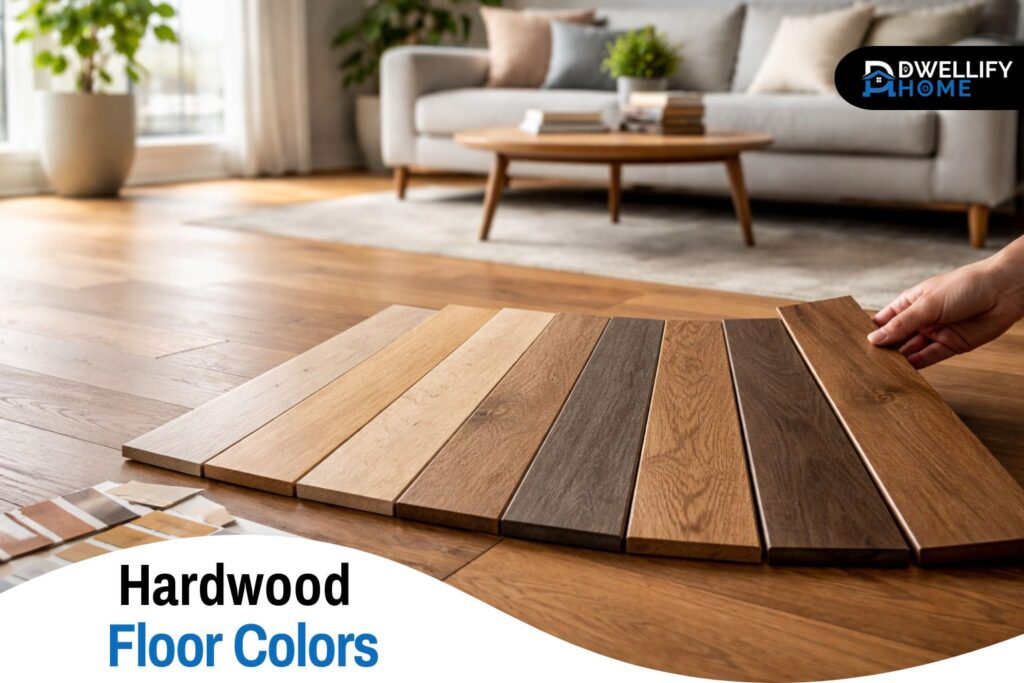
Hardwood floor color is one of those choices that feels simple until you’re standing in a showroom holding five samples that all look “pretty much the same.” Then you bring them home, and suddenly one turns orange, one looks gray, and the one you loved in the store feels way darker in your living room.
I’ve helped homeowners make this decision (and fix it when it goes wrong) for years, and the biggest lesson is this: you’re not just choosing a color. You’re choosing how your home will feel every day, how much cleaning you’ll notice, and how easy it’ll be to change furniture or paint later without the floor fighting you.
This guide will walk you through it in a clear, practical way—so you can land on a floor you’ll still like when the new-rug excitement wears off.
Snippet-Ready Definition:
Hardwood floor colors refer to the natural tones or stained finishes applied to wood flooring. They influence how a room feels, how light reflects, and how easily floors coordinate with walls, cabinets, and furniture.
Mission Statement:
Dwellify Home helps homeowners make practical, stylish, and informed décor decisions with clear, experience-based guidance.
Quick Start: A Simple 4-Step Choice Framework
The easiest way to avoid decision fatigue is to choose in this order. Skipping steps is where most regrets come from.
First, pick your color depth: light, medium, or dark. This controls the overall vibe—airy, balanced, or moody—and it also affects what you’ll see day to day (dust, pet hair, micro-scratches).
Next, lock in undertone: warm, cool, or neutral. Undertone is the part people miss, and it’s why a “brown” floor can look pink, golden, or even slightly green next to your cabinets.
Then choose your finish look—matte, satin, or gloss. This doesn’t just change shine. It changes how the color reads and how the floor hides wear.
Finally, confirm with real samples at home. Store lighting is flattering. Your home lighting is honest.
Quick Comparison Guide: Choosing a Floor Color
| Color Depth | Best For | Watch Out For |
| Light | Small rooms, modern styles, low contrast spaces | May show dark pet hair |
| Medium | Flexible design, resale appeal, busy homes | Can feel plain if undertone clashes |
| Dark | Formal rooms, dramatic interiors | Shows dust and scratches more easily |
Key Decision Factors
- Room lighting (north vs south-facing exposure)
- Undertone coordination with cabinets and trim
- Maintenance tolerance (dust, pets, traffic)
- Long-term flexibility with décor changes
- Wood species, especially oak hardwood floor colors
Hardwood Floor Color Families
Light hardwood floors are great when you want the space to feel open and calm. They’re popular in modern interiors for a reason—light oak and natural tones make rooms feel bigger, especially in apartments or homes with limited daylight.
The surprise? Light floors can still show mess. Not always dirt, but contrast. If you have dark pets, you may notice hair more than you expected. And if you choose a very pale, uniform look, scuffs near doorways can stand out.
Medium tones are the “easy to live with” option. They hide daily life better than super light or super dark floors, and they’re flexible if you like changing paint colors, rugs, or decor. If a client tells me they want something safe but not boring, this is where we usually land.
Dark floors look rich and dramatic, but they demand honesty about your habits. They can show dust, footprints, and fine scratches more than people expect—especially in sunny rooms. If you love dark, consider a finish and grain pattern that adds variation. A slightly more textured, less glossy look tends to be more forgiving.
Undertones: The Hidden Factor That Makes or Breaks the Look
Two floors can be the same “shade” and still look completely different because undertones are doing the real work. Warm undertones pull toward gold, red, or honey. Cool undertones can lean gray or slightly taupe. Neutral undertones sit in the middle and play nicely with more styles.
A quick way to spot undertone: place the sample next to something truly neutral—white printer paper works. If the wood suddenly looks yellow, pink, or gray, you’ve found its bias.
Undertone also decides whether your floor will fight your other finishes. Warm floors can clash with cool gray walls. Cool floors can make warm beige paint look a little muddy. Neutral floors are often the easiest bridge when you have a mix of warm and cool elements in the same space.
One practical rule that saves a lot of headaches: don’t try to match everything perfectly. Aim for either clear coordination or intentional contrast. “Almost matching” is what usually looks accidental.
Real Hardwood Floor Colors: What Changes the Final Result
Online images are useful for ideas, but real hardwood floor colors are shaped by things a photo can’t show: species, grain, and how your home reflects light.
Species matters a lot. The same stain on maple won’t look the same on oak. Oak has open grain and takes stain differently, often with more visible variation. Maple can look blotchy with darker stains if it isn’t prepped correctly. That’s why a stain name on a chart is only a starting point.
Grade and grain matter too. Select grade (clean, minimal knots) reads more modern and uniform. Character grade (more variation) reads warmer and tends to hide everyday wear better because the eye isn’t focused on perfect consistency.
Then there’s aging. Some woods deepen over time, and sunlight will shift color faster than you expect. If you have a bright room with big windows, plan for change. It’s normal—but it should be planned, not a surprise.
Oak Hardwood Floor Colors: White Oak vs Red Oak
Oak is the most common hardwood I see in homes, so it deserves its own section. White oak and red oak aren’t just different names—they behave differently.
White oak usually reads a bit calmer and more modern. It takes neutral stains well and can look great in natural finishes, especially paired with matte sheen. If you’re aiming for modern hardwood floor colors that feel clean and not too yellow, white oak is often the easier path.
Red oak has warmth built in. That can be beautiful in traditional homes, but it’s also where the “why does it look orange?” complaint comes from. Red oak’s natural tone can push warm, especially under warm bulbs or next to creamy paint.
Best stain directions for oak usually fall into a few lanes:
- Natural or lightly toned for a timeless look
- Balanced browns (great for a classic feel)
- Darker walnut/espresso if you want drama and can handle maintenance
- Carefully chosen neutrals if you want modern without turning gray
If you’re worried about orange, focus on undertone control—neutral stains and the right lighting do more than chasing a trendy color name.
Hardwood Floor Colors Stains: Choosing a Stain Direction That Won’t Date Fast
Stain decisions go smoother when you stop thinking in single colors and start thinking in families.
Natural or clear finishes are the least risky long term. They let the wood look like wood, and they usually age gracefully. If you like updating your home over time, this is a smart base.
Brown hardwood floor colors cover a huge range, from soft warm browns to deeper “brunette” tones. Browns are classic for a reason: they work with warm paint, cool paint, and most cabinets. The key is picking a brown that matches your undertone plan—some browns lean red, others lean gray.
Gray and greige stains can look sharp in the right home, but they’re easiest to get wrong. In low light, they can feel cold. In sunny rooms, they can look a little washed out if the floor is too uniform. If you like this direction, test it next to your wall color and your sofa fabric. Those two will decide whether it feels calm or lifeless.
Very dark stains (walnut, espresso, ebony) can look stunning in photos, but they show the “reality layer” of living—dust, scratches, and pet hair. If you still want dark, choose a lower sheen and don’t chase a perfectly solid, flat color. A little variation helps.
Finish sheen matters here. Matte tends to look more current and hides wear better. Satin is a classic middle. Gloss is the one I rarely recommend for busy homes because it highlights everything.
Hardwood Floor Color Chart: How to Use Charts Without Getting Misled
A hardwood floor color chart is helpful for narrowing choices, not finalizing them. The biggest mistake is trusting a chart like it’s a paint chip.
Screens lie. Store lighting lies. Even the same stain looks different depending on sanding, wood species, and finish coat. Use charts to pick a direction—then bring home real samples.
Here’s the method I use with clients who feel stuck:
- Choose a lane (light, medium, or dark).
- Pick three options that are clearly different from each other.
- View them in your home at three times: morning, afternoon, and night.
- Eliminate the one that changes the most in a bad way.
- Compare the remaining two next to your cabinets and trim, not in the middle of the floor.
That keeps you from looping endlessly through “maybe this one… or that one…”
Lighting and Layout: Make the Color Choice Match Your Home
Lighting is the reason a floor you loved can feel wrong once it’s installed. A north-facing room tends to pull colors cooler. A south-facing room often warms them up. That can be a win or a problem depending on your undertones.
Bulb color matters too. Warm bulbs (soft white) can push wood toward golden. Cooler bulbs can make warm wood look dull. Before you decide, look at your samples under the actual bulbs you use at night.
Open-concept homes add another layer. A color that looks perfect in the living room might look too dark in the hallway. In connected spaces, you usually want a floor that stays consistent across light changes. Medium tones and balanced undertones tend to be easiest in open layouts.
Room-by-Room Color Guidance
Living rooms need flexibility. They’re the space where rugs, sofas, and wall colors change most. Medium tones or natural oak usually age well here because they don’t lock you into a single style.
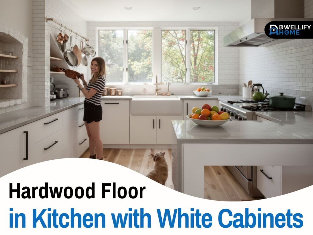
Kitchens are about coordination. Floors don’t need to match cabinets, but undertones should make sense together. If your cabinets are warm (cream, oak, warm white), a very cool gray floor can feel disconnected. If your cabinets are crisp white or modern flat-panel, neutral or cooler floors often look cleaner.
Hallways and entries take the most abuse. Medium tones with some grain variation are the most forgiving. Ultra-dark and ultra-light can both show traffic patterns faster near doors.
Bedrooms are where comfort matters. Warm neutrals and lighter natural tones feel calmer. Cooler grays can work, but they need good lighting and soft textiles so the room doesn’t feel chilly.
Small or low-light rooms usually do better with lighter to medium floors. Very dark floors can make the room feel smaller unless you have strong lighting and light walls to balance it.
Match Your Style: Modern vs Traditional vs Rustic
For modern homes, look for clean, neutral direction: natural oak, soft neutrals, and matte finishes. Lower contrast between plank colors tends to feel more contemporary.
Traditional spaces often suit warmer browns and richer tones. They pair well with classic trim profiles and warmer paint colors. Red oak can work beautifully here if the undertone matches your palette.
Rustic and farmhouse styles usually benefit from character and variation—knots, grain, and a bit of movement. These floors hide life better and feel more relaxed.
Minimal and Scandi looks typically lean light: pale oak, natural finishes, and simple grain. This style works best when you avoid high gloss and keep the rest of the finishes calm.
Wood Floor Color Trends 2025 and What Stays Timeless
Trends are useful when they push the market toward better basics—like more natural tones and matte finishes. Wood floor color trends 2025 continue to lean into natural oak looks, warmer neutrals, and finishes that feel less shiny and more “real.”
Deeper browns have also been making a comeback in some designs. They can look great, but they’re a commitment. If you like the look, aim for a brown with balanced undertones rather than something that reads very red or very cool.
What I’d be careful with is anything that looks overly processed: heavy gray-wash, flat artificial-looking tones, or extreme uniformity that doesn’t feel like wood anymore. Those choices tend to date faster because they’re tied to a specific moment.
A timeless checklist is simple:
- Choose a depth that fits your light
- Choose an undertone that matches your fixed finishes
- Keep the finish realistic (matte or satin often wins)
- Don’t pick based on a single photo
Maintenance Reality Check for Busy Homes
The “best” color is the one you won’t resent after the first month of real living. Light floors can show dark hair. Dark floors can show dust and micro-scratches. Medium tones hide the most day-to-day mess.
If you have kids, dogs, or heavy traffic, prioritize:
- Lower sheen (matte/satin)
- Grain or variation that hides minor wear
- A tone that won’t show every crumb by contrast
Also, remember that maintenance isn’t just cleaning—it’s what your eyes notice. A floor that looks “fine” between cleanings feels easier to live with.
Budget Notes: Hardwood Flooring Prices and Color-Related Costs
Hardwood flooring prices are driven mainly by species, plank width, grade, and the finish system—not just color. Wider planks and premium grades cost more. Some species cost more simply because supply is tighter.
Color choices can affect price when you need extra labor:
- Custom stain matching takes time and tests
- Dark stains can require more careful prep to avoid lap marks
- Some “modern” looks involve special treatments or multi-step finishes
Where it’s usually worth spending: the installer’s prep and the finish quality. A great stain on a poorly prepped floor won’t look great for long.
No-Regrets Sampling Checklist
This is the part I wish every homeowner did before signing off:
- View samples in the room where they’ll be installed, not just one spot
- Check them in morning daylight, late afternoon, and nighttime lighting
- Place them next to cabinets, trim, and your main wall color
- Look at them from standing height, not just up close
- If you’re staining existing floors, ask for a real test patch on your wood, after sanding
That last step is the closest thing to truth you’ll get before committing.
FAQ: Fast Answers People Search
What is the most popular color for hardwood flooring?
Natural to medium brown tones, especially white oak in a matte finish, remain the most widely chosen because they balance warmth and flexibility.
What color wood floor never goes out of style?
Natural or medium neutral tones tend to age best. They adapt easily to changing paint colors and furniture styles.
Should your flooring be lighter or darker than your walls?
A slight contrast works best. Floors that are either clearly lighter or clearly darker than the walls create visual balance. Avoid almost-matching shades.
What is the hardwood trend in 2026?
Natural-looking finishes, warm neutrals, wider planks, and lower sheen surfaces continue to lead. Overly gray or high-gloss finishes are fading.
Do dark hardwood floors make a room look smaller?
They can, especially in low-light spaces. Proper lighting and lighter walls help balance darker floors.
Conclusion
Choosing hardwood floor colors gets easier when you stop chasing a “perfect” shade and start choosing a direction that fits your home: color depth, undertone, lighting, and how you actually live. Medium and natural tones win for flexibility, but the right answer depends on your rooms, your finishes, and your tolerance for maintenance.
Bring home real samples, look at them in your actual lighting, and let the floor support the rest of your design instead of competing with it. That’s the path to a choice you’ll feel good about years from now.
Disclaimer:
Information provided is for general educational purposes. Always confirm product details, samples, and installation advice with qualified flooring professionals.

I’m Bilal, the founder of Dwellify Home. With 6 years of practical experience in home remodeling, interior design, and décor consulting, I help people transform their spaces with simple, effective, and affordable ideas. I specialize in offering real-world tips, step-by-step guides, and product recommendations that make home improvement easier and more enjoyable. My mission is to empower homeowners and renters to create functional, beautiful spaces—one thoughtful update at a time.