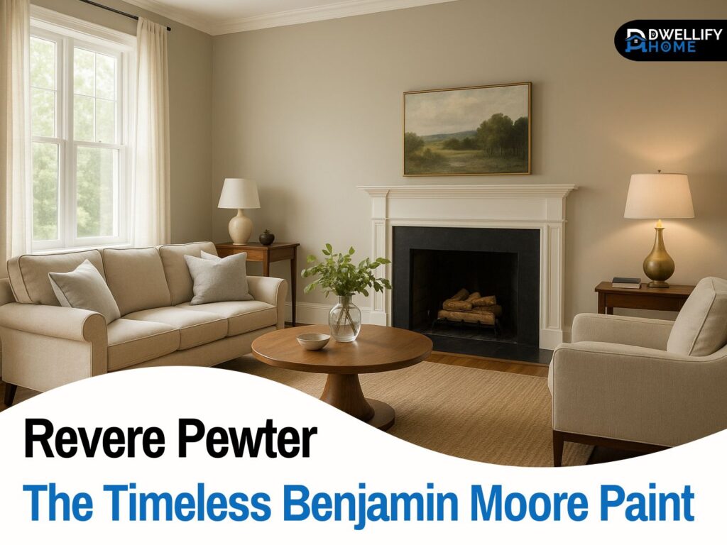
Choosing a very soft gray can feel simple, until it’s on your wall and suddenly it looks blue, green, beige, or even a little purple. I’ve seen this happen in real homes more times than I can count, especially with light light gray paint. It’s a beautiful direction, but it’s also one of the easiest to misjudge because it changes so much with lighting and surrounding materials.
In this guide, I’ll walk you through how I help clients pick a light, pale gray that stays calm and consistent, whether you’re painting one room or the whole house. You’ll get clear steps, real-world checks, and the small details that make the biggest difference.
Snippet-ready definition:
Light light gray paint is a very pale gray that sits close to off-white. People use it to brighten rooms, soften contrast, and create a modern, calm backdrop that pairs easily with wood, trim, and décor.
Mission Statement:
At Dwellify Home, our mission is to make decorating feel less confusing and more doable, with practical, design-backed guidance that helps you choose colors and finishes you’ll enjoy living with every day.
What Light Light Gray Paint Really Means
When most homeowners say light light gray paint, they usually mean a shade that sits right between off-white and soft gray. It’s often called very light gray paint, pale gray paint color, or even almost white gray paint. On a paint chip, these shades can look nearly identical, but on a full wall they behave very differently.
The reason is simple. Light gray colors are subtle, and subtle colors reflect what’s around them. A light pale gray will pick up warmth from oak floors, coolness from bright white trim, and color casts from nearby furniture. That’s why a paint that looked perfect in one home can feel wrong in another, even if the paint formula is the same.
If you’re choosing interior light gray paint for a main space, think of it as choosing a background tone for your whole room. It shouldn’t fight your finishes. It should quietly support them.
Quick Guide Table (Comparison)
| What you want | Best direction | Why it works | Watch out for |
| Cozy, welcoming walls | Warm light gray or greige | Works with warm floors and soft whites | Can look a bit beige in strong sun |
| Clean, balanced look | Neutral light gray | Most flexible across rooms | Still needs proper sampling |
| Modern, crisp vibe | Cool light gray | Sharp with bright white trim | Can feel cold in north light |
| Small room feels bigger | Higher LRV pale gray | Reflects more light | Can look washed out under harsh LEDs |
| Easy-clean family spaces | Eggshell or satin finish | Wipes better, holds up | Satin can highlight wall texture |
Quick Steps (How to choose without regrets)
- Pick undertone first: warm, neutral, or cool based on your floors and trim.
- Test big: poster-size sample board, not a tiny swatch.
- Check 3 spots: bright wall, dark corner, near your main finish.
- View day to night: morning, afternoon, and with lamps on.
- Choose finish by room: matte for low-traffic, eggshell for most rooms, satin for kitchens and baths.
The 4 Things That Decide Whether Your Light Gray Looks Perfect (or Turns Weird)
Undertones (Warm, Cool, or Greige)
Undertone is the color hiding underneath the gray. It’s not the main color you see first, but it shows up once the paint is on a larger surface.
Here’s the quick breakdown I use with clients:
- Blue or green undertones can feel crisp, but they can also look chilly or a bit sterile in low light.
- Beige undertones feel warmer and softer, especially with wood floors.
- Violet undertones are less common, but they can show up in certain lighting and next to certain whites.
If you want light grey paint walls that feel welcoming, many people end up happiest with a warm-leaning pale gray or a gentle greige. If you prefer a cleaner, more modern look, a balanced neutral gray can work well, as long as the room has enough natural light.
Light Direction and Time of Day
This is where many “perfect gray” plans fall apart. The same paint can look totally different depending on which direction your windows face.
A simple real-life example: I worked with a client who picked a pale gray that looked airy in her south-facing kitchen. She used the same paint in a north-facing hallway, and it looked noticeably cooler and slightly blue by afternoon. Nothing was wrong with the paint. The light was different.
As a rule of thumb:
- North-facing rooms usually make grays look cooler and flatter.
- South-facing rooms can warm them up and make them look softer.
- East-facing rooms often look bright in the morning and calmer later.
- West-facing rooms can look neutral early and warmer at sunset.
Fixed Finishes That Pull the Color
Fixed finishes are the things you’re not changing anytime soon, like flooring, countertops, tile, cabinets, and large rugs. These surfaces influence what your paint reads as.
If you have warm oak floors, a cool gray can suddenly look icy. If you have cool gray tile, a warm gray might look a bit beige. If you have creamy trim, a crisp cool gray can highlight that cream and make it feel yellow.
One of the best ways to choose light light gray paint for walls is to compare paint samples directly against your biggest finishes. Put the sample next to your floor, then next to your countertop, then next to your trim. You’ll see the undertone faster than you will by staring at a paint chip.
LRV (Light Reflectance Value) in Simple Terms
LRV is a number that tells you how much light a paint reflects, on a scale from 0 to 100. Higher LRV means a color looks brighter and lighter, which is often what people want when they choose a very pale gray.
Here’s the practical part: high-LRV grays can look clean and open in a bright room, but in a room with harsh artificial lighting they can look a bit washed out. Low-LRV grays can look richer and more grounded, but they can also make a small room feel heavier.
If you want a light, soft look, you’ll usually be shopping in the higher LRV range. Just remember that the room’s lighting will decide whether that brightness feels fresh or flat.
What Is the Most Popular Light Gray Interior Paint Look Right Now?
Instead of chasing one exact paint name, I recommend choosing the look that fits your home. That’s how you get a result that stays right even when trends shift.
Most homeowners land in one of these three buckets:
Soft warm light gray, often a greige-leaning shade
This is the easiest path for many homes. It works well with warm woods, creamy whites, beige stone, and cozy textures. If your goal is calm and welcoming, this is often the safest option.
Balanced neutral light gray
This works best when your finishes are already balanced, not overly warm and not overly cool. It’s a good choice for open concept spaces because it doesn’t pull strongly in one direction.
Cool light gray
Cool grays can look sleek and modern, especially with crisp white trim, black accents, and cooler flooring. But they need the right setting. In dim rooms, they can feel colder than expected, so testing is non-negotiable.
This is the practical answer to what is the most popular light gray interior paint. The most popular choice is the one that matches the home’s permanent materials and the way the light moves through the space.
Best Light Light Gray Paint for Walls (Shortlist by Situation)
When clients ask for light light gray paint for walls, they usually want something that looks soft and clean without turning blue, green, or beige at the wrong times. I like to choose by situation rather than by hype.
Best for most homes
Look for a light gray that leans slightly warm or neutral. It tends to play nicely with common finishes like oak floors, beige carpets, and soft white trim.
Best for bright sunny rooms
A balanced or slightly cool light gray can stay crisp in strong sunlight. If you choose a warm gray here, it can sometimes read a little more beige than expected.
Best for low natural light
This is where I almost always avoid strong cool undertones. A gentle warm-leaning pale gray often looks more comfortable and less shadowy, especially in hallways and bedrooms.
Best almost-white light gray
If you want that minimal look, choose a very light gray that’s close to an off-white, with a soft undertone that matches your trim. This gives you definition without looking like a darker gray.
If your goal is light grey paint walls that stay consistent, choose the undertone first, then confirm with sampling. That one step prevents most regrets.
Best Light Light Gray Paint for Living Room (So It Doesn’t Look Flat)
A living room has a different job than a hallway or a bathroom. It has more furniture, more texture, and usually more mixed lighting. That mix is what can make a pale gray look a little dull if it’s not chosen carefully.
For open concept living spaces, I look for a light gray that flows well into nearby rooms. A neutral or slightly warm pale gray is usually easiest, especially if the kitchen cabinets or floors lean warm.
For small living rooms, a higher-LRV shade helps keep the room open. But I also pay attention to sheen and trim color, because too much contrast can make the walls feel busy.
For living rooms with warm floors, I almost always test a warm-neutral gray first. It keeps the room feeling connected instead of fighting the wood tone. This is one of the most common situations where a cool gray ends up feeling off.
If you want light light gray paint for living room walls to feel layered, add contrast through textiles and décor, not by pushing the wall color darker. Think natural wood, linen textures, black accents, and a few warmer pieces to keep the gray from feeling flat.
Home Depot Light Gray Paint Options (How to Shop Without Guessing)
If you’re shopping for home depot light gray paint, the biggest challenge is the huge number of similar-looking options. The easiest way to narrow it down is to decide your undertone first.
Here’s the simple approach I use with clients who want to buy locally:
- Choose your brand line and pick 3 to 5 candidates that match your undertone goal.
- Ignore the tiny paper chip as your final test. Use it only to shortlist.
- Bring home samples and test them on a large surface.
Also, try to view the sample next to your trim and your main flooring. A pale gray that looks perfect under store lighting can shift a lot at home, especially under warm bulbs.
How to Test Light Pale Gray the Right Way (Pro Method)
Testing is where you win or lose with light pale gray. These colors are subtle, so small test swatches often lie.
Here’s the testing method I trust:
- Paint a large sample board, at least poster-size, or use two big sample sheets.
- Place it on the wall in three spots: the brightest wall, the darkest corner, and near your main fixed finish.
- Check it in the morning, midday, and at night with lamps on.
One quick case from my work: a client loved a pale gray in daylight. At night, her warm LED bulbs made it look slightly beige. We didn’t change the paint. We changed the bulb temperature in the main fixtures, and the gray went right back to what she wanted.
Lighting choices are part of paint color choices. If the paint feels wrong only at night, the fix might be your bulbs, not your walls.
Best Trim, Ceiling, and Door Colors With Light Gray Walls
The trim color you choose can make your light gray look cleaner, warmer, or unexpectedly tinted. That’s why I always look at trim and wall color together.
Crisp bright white trim
This looks sharp and modern. It works well with cool or neutral grays, and it gives clear contrast. Just be careful, because bright white can make a warm gray look more beige next to it.
Soft white trim
This feels calmer and more classic. It’s often the better choice if your walls are warm gray or greige and your home has warm finishes.
For ceilings, most homes do well with a clean white that isn’t too stark, especially if the walls are very pale. For doors, you can keep them the same as trim for a seamless look, or go a touch darker for definition in a modern space.
What Colors and Materials Look Best With Light Gray Walls
Light gray walls are flexible, but they still need the right supporting cast. The goal is to match the undertone, then choose accents that add warmth, contrast, or softness.
Pairings that work in real homes:
- Warm woods like oak and walnut add life to pale gray walls.
- Black accents give definition without making the room feel heavy.
- Brass adds warmth, while chrome keeps things cooler and cleaner.
- Accent colors like sage, navy, clay, terracotta, and muted blush can all work, depending on the undertone.
If your gray leans cool, warm accents help balance it. If your gray leans warm, cooler accents can keep it feeling fresh.
Best Paint Finish for Light Gray Walls (Sheen Guide)
Finish matters more than most people expect, especially with light colors.
Matte
Great for low-traffic spaces like bedrooms and ceilings. It hides wall imperfections well, but it can mark more easily.
Eggshell
My most common pick for living rooms and hallways. It’s soft, easy to clean, and it doesn’t highlight texture the way shinier finishes can.
Satin
Best for kitchens, bathrooms, and kids’ spaces where wiping matters. It reflects more light, so it can make the color look slightly brighter, sometimes a touch cooler.
If you want your interior light gray paint to look smooth and even, choose the finish based on how the room is used, not just on what looks good on a sample chip.
Common Mistakes With Light Light Gray Paint (and Easy Fixes)
The most common mistake is choosing a gray that’s too cool for the room’s light. This is especially common in north-facing rooms and shaded homes. The fix is usually choosing a warmer undertone or adjusting lighting.
Another mistake is ignoring the fixed finishes. A gray that clashes with flooring or countertops will never feel settled. The fix is to match undertones, then retest next to those materials.
Skipping sample tests is the fastest way to end up repainting. The fix is simple, test large and check it across the day.
Choosing the wrong sheen is another quiet problem. Too much shine can make walls look patchy. Too little can make high-traffic areas hard to clean. The fix is usually eggshell for most main rooms, satin for moisture and mess zones.
Quick FAQ
1) What is the most popular light gray paint color?
There isn’t one perfect winner for every home, but the most popular look is a soft warm-neutral light gray that works with common floors, trim, and mixed lighting.
2) What color is the lightest grey?
The lightest greys are usually “almost-white” grays with very high LRV. They look like off-white at a glance but show a soft gray cast in certain lighting.
3) Is light gray paint still in style?
Yes. In 2026, the shift is toward softer, warmer light grays and pale greiges that feel calm and natural, rather than icy, blue-leaning grays.
4) What is the most relaxing grey paint?
A relaxing gray is typically a warm or neutral pale gray with gentle undertones, not a sharp cool gray. It feels softer, especially in bedrooms and living rooms.
5) Why does my light gray look blue or green at home?
That’s usually undertone plus lighting. North-facing rooms and cool LED bulbs can pull blue or green. Testing large samples in your room helps you catch this early.
Conclusion
A light light gray paint can be one of the most calming choices you make, but it needs a little respect. The shade that looks soft and clean in your mind can shift fast once it meets real light, real floors, and real trim.
If you remember just a few things, make them these: pick your undertone first, test it large, and check it morning to night. Match the gray to your fixed finishes, then choose the right sheen for how the room is used. Do that, and you’ll end up with light gray walls that feel steady, comfortable, and easy to decorate for years.
Disclaimer:
This guide offers general interior design advice based on real-world color consulting practices. Paint colors can vary by lighting, surface texture, and brand batches, so always test a sample in your own space before committing.

I’m Bilal Hassan, the founder of Dwellify Home. With 6 years of practical experience in home remodeling, interior design, and décor consulting, I help people transform their spaces with simple, effective, and affordable ideas. I specialize in offering real-world tips, step-by-step guides, and product recommendations that make home improvement easier and more enjoyable. My mission is to empower homeowners and renters to create functional, beautiful spaces—one thoughtful update at a time.