A good furniture layout isn’t about following strict rules. It’s about making a room feel easy to live in. You should be able to walk through it without weaving around corners, sit down without feeling cramped, and look around without the space feeling “off” on one side.
Over the years, the layouts that work best usually come down to two things: flow (how people move) and balance (how the room feels visually). Once you get those right, the rest—style, decor, even the wow factor—comes a lot more naturally.
Snippet-Ready Definition:
Arranging furniture in a room means positioning pieces so the space feels balanced, functional, and easy to move through. Good layouts improve traffic flow, support daily activities, and make rooms feel more comfortable and visually organized.
Mission Statement:
Dwellify Home helps homeowners create comfortable, well-balanced living spaces with practical design guidance and thoughtful decorating advice.
Start with the room’s purpose (the decision that fixes half the layout)
Before you move a single chair, decide what the room needs to do most days. A living room that’s mostly for TV has a different layout than one that’s used for conversation, board games, or kids doing homework at the coffee table. Rooms feel awkward when the furniture is arranged for a lifestyle you don’t actually have.
Think about how people really use the space:
- Where do you naturally drop your bag or set a drink?
- Do you host guests often, or is it mostly family time?
- Does anyone need a clear path for mobility (kids, pets, older family members)?
This is also where you get honest about friction points. If you’re constantly stepping around an ottoman, or the dining chairs scrape because there’s no clearance, that’s not a “styling issue.” That’s the room telling you the purpose and the layout don’t match.
Key Principles of Furniture Arrangement
- Start with the largest piece and build the layout around it
- Identify a focal point such as a window, fireplace, or TV
- Maintain clear traffic paths so movement feels natural
- Balance furniture size and height across the room
- Use rugs, lighting, and tables to anchor seating areas
Measure first, then plan (fast and realistic)
You don’t need a full design program to plan a layout, but you do need basic measurements. Most bad arrangements happen because people eyeball it, then keep forcing it when it doesn’t feel right. A few quick measurements save hours.
At minimum, measure:
- The room’s length and width
- Door swings (how far doors open)
- Windows and radiators/vents (things you shouldn’t block)
- The big pieces: sofa, bed, dining table, media console
Then choose a planning method you’ll actually use. Three that work in real homes:
- A quick sketch on paper with rough dimensions
- A phone app or basic floor plan tool
- Painter’s tape on the floor to outline the sofa, rug, and table
One rule that holds up almost every time: place the largest piece first. In a living room, that’s usually the sofa. In a bedroom, it’s the bed. Once that anchor is in the right spot, the rest of the layout stops feeling like guesswork.
Choose the focal point (so the room feels intentional)
Rooms feel “designed” when the furniture points toward something on purpose. That “something” is the focal point. In many homes it’s a fireplace, a big window with a view, built-in shelving, or a strong feature wall.
The focal point helps you answer the question: where should the main seating face? When you don’t decide this, furniture floats around in random directions, and the room feels unsettled—even if everything technically fits.
Sometimes the TV becomes the focal point, and that’s fine. The trick is keeping the room from turning into a row of seats facing a screen. A layout can be TV-friendly without looking like a waiting room. Often that means:
- Angling a chair slightly instead of lining everything up
- Keeping side tables and lighting balanced so the TV wall isn’t the only “heavy” area
- Making sure the sofa isn’t so far back that conversation becomes awkward
No obvious focal point? Create one. A large piece of art, a statement mirror, a console with a lamp, or even a pair of shelves can give the room a “front” to organize around.
Map traffic flow (the “can you move naturally?” test)
This is where most rooms go wrong. People arrange furniture based on where it looks good, then realize they’ve blocked the path people actually take.
Start by identifying your main paths:
- From the doorway into the room
- From seating to other spaces (kitchen, hallway, balcony)
- From seating to storage (TV console, bookcase, closet)
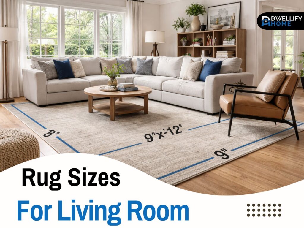
As a general comfort target, main walkways usually feel best with roughly 30–48 inches of clear space. That number isn’t a law, but it’s a good gut-check. For coffee tables, a common comfortable reach is around 18 inches from the sofa edge, give or take. You want it close enough to use, but not so close you’re bumping your knees.
Flow problems usually have simple fixes:
- Rotate one piece instead of moving everything
- Swap a rectangular table for a round one to soften corners
- Replace a bulky chair with a slimmer profile
- Pull a sofa forward a few inches so the path behind it opens up
After you think you’ve got it, do a walk test. Literally walk the paths you use daily. If you have to turn sideways or step around a corner, the room will never feel relaxing.
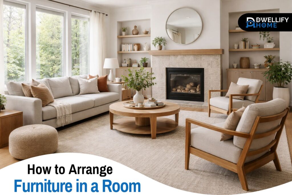
Anchor the layout with the biggest piece
Once purpose, measurements, focal point, and flow are clear, place the anchor piece. In most living rooms, that’s the sofa. Where it usually works best depends on the room:
- Facing the focal point when possible
- On the longest uninterrupted wall if the focal point is tricky
- Floating slightly forward if the room is deep and you need better connection
A lot of people push furniture against walls because it feels like it “opens up” the room. In practice, that often makes the center feel empty and the seating feel disconnected. Floating furniture—pulling it away from the wall—creates a more comfortable zone and often improves balance.
That said, there are real exceptions. In very small rooms, or when doorways steal wall space, pushing a piece against the wall may be the only way to keep a clear path. The goal isn’t to follow a trend. The goal is a layout that makes daily life smoother.
Build a comfortable seating zone
The best seating zones feel easy. You can sit, talk, reach a drink, and get up without shuffling furniture.
Start by arranging seating for conversation first, then layer in TV viewing if needed. Even in TV rooms, conversation matters because people still chat before the show starts, during pauses, or when guests visit. A simple way to get this right is to avoid placing all seats in a straight line. Add a chair across from the sofa, angle a seat slightly, or use an L-shape.
Then add “landing spots,” because real rooms need them. I’ve seen beautiful layouts fail because there’s nowhere to put a cup, no light near the reading chair, and no easy charging point. A strong seating zone usually includes:
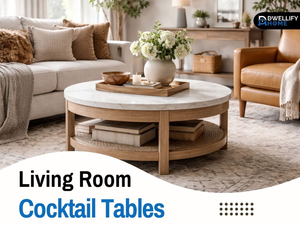
- A coffee table or ottoman (or a pair of smaller tables)
- Side tables within reach of seating
- Lighting that works at night (not just overhead)
This is also where you avoid common comfort mistakes: a coffee table that’s too far away, a chair that blocks the path, or a rug that’s too small and makes the whole zone look like it’s floating.
Balance and scale (so the room doesn’t feel lopsided)
Balance isn’t about symmetry. It’s about visual weight. A big sofa on one side and nothing on the other will make a room feel like it’s tilting, even if the measurements are “fine.”
A few practical ways to balance a room:
- Pair tall items with tall items across the space (bookcase on one side, floor lamp or plant on the other)
- Mix heights so everything isn’t the same level (low sofa, taller lamp, mid-height sideboard)
- Spread large pieces instead of clustering them (don’t stack sofa, bulky chair, and heavy console all on one side)
Symmetry works well in more formal rooms or when you want calm. Asymmetry works well in relaxed spaces, especially open concept areas. Either can feel balanced—what matters is that the room doesn’t have all its weight gathered in one corner.
Scale matters too. A tiny rug under a huge sectional, or a tiny end table next to an oversized chair, makes the whole layout feel off. If a room feels “wrong” but you can’t explain why, scale is often the culprit.
Use rugs to define zones and improve flow
Rugs do more than decorate. They tell your brain where the zone starts and ends.
In living rooms, a common mistake is choosing a rug that’s too small, then placing it like a mat in front of the sofa. It makes the seating area feel disconnected. A better approach in most rooms is letting the front legs of the sofa and chairs sit on the rug. In larger rooms, having all legs on the rug can look even more grounded.
Rugs also help open concept spaces. Instead of trying to “fill” the space with random furniture, you create clear islands:
- A living zone anchored by a rug
- A dining zone anchored by the table (sometimes with a rug, sometimes not)
- A reading corner anchored by a smaller rug and lamp
This zoning is a big part of flow. People move more naturally when the room has visible, intentional areas.
Respect light, sightlines, and comfort
Even a perfectly measured layout can feel wrong if it fights the room’s light or blocks what you see when you enter.
Try not to block windows with tall furniture unless there’s no other choice. Natural light makes rooms feel larger, and blocking it often makes a space feel heavier. Also avoid placing furniture in front of radiators, vents, or AC units. It affects comfort and can create uneven heating or cooling.
Use the doorway view test. Stand in the doorway and notice what you see first. Ideally, you see something inviting: the seating area, a focal point, or a clear path into the room. If the first thing you see is the back of a tall chair, a cluttered side table, or a hard corner to dodge, the room will feel less welcoming.
For TV and desk areas, glare matters. Sometimes a small shift—moving the screen off-axis from the window, or placing a desk perpendicular to the light—makes the room instantly more comfortable.
Living room layouts that work in most homes
Most living rooms land in one of these three setups.
Layout A: Conversation-focused
The sofa and chairs face each other in a loose U or L shape, with a table in the middle. This works well for hosting and everyday comfort.
Layout B: TV-friendly without feeling like a theater
Seating still has a conversational angle, but it’s oriented enough that the TV is easy to view. A chair can be slightly angled rather than directly lined up.
Layout C: Mixed-use (talking + TV + reading)
The main seating faces the focal point, and a separate chair + lamp create a reading corner. This keeps the room functional without everything revolving around the screen.
Choose the one that fits your real routine, not the one that looks best in a staged photo.
Bedroom furniture arrangement basics
In bedrooms, flow is everything. The bed is the anchor piece, and it usually feels best on the largest solid wall. You want a clear path around it, and you want to avoid placing it where you feel squeezed between the bed and a wall.
Try to leave comfortable walking clearance on at least one side, and ideally both. Nightstands aren’t just for looks—they keep the room practical. Even a small wall-mounted shelf can work if floor space is tight.
Dressers and wardrobes should go where doors and drawers can open fully. It sounds obvious, but I’ve walked into more bedrooms than I can count where a dresser can’t open without hitting the bed. That layout will never feel calm, no matter how pretty the bedding is.
Dining room furniture arrangement basics
The dining table needs breathing room. Chairs should pull out without scraping walls or bumping into a sideboard. If space is tight, prioritize clearance on the most-used sides, and consider a round table to soften movement.
A sideboard or buffet works best on a wall where it won’t choke the path. It should support the room’s purpose: serving food, storing dishes, or acting as a landing space during gatherings. If it turns into a bottleneck, it’s in the wrong spot or it’s the wrong size.
Small home office or study corner
For desks, placement depends on light and distraction. Facing a wall can help focus, but placing a desk near natural light can make the space more pleasant—as long as glare isn’t an issue.
Cable access matters more than most people expect. Outlets are part of the layout. A desk that looks great but forces cords across a walkway will always feel messy. Plan where the power is, where the lamp goes, and where devices charge before you settle on the desk position.
Also consider what’s behind you. For video calls or daily work, a clean background or a simple wall is usually more comfortable than having a busy room behind your chair.
Studio or multipurpose rooms
Studios and multi-use rooms work best when they’re zoned. You don’t need walls—you need clear boundaries.
A common approach is using the back of a sofa to define the living zone, with the bed area separated by a rug, a shelf unit, or a screen. The key is keeping flow open. You want to move through the space without cutting through the middle of your “zones.”
In these rooms, multi-functional pieces earn their keep. Storage ottomans, nesting tables, or a bench that doubles as seating and storage can support the layout without adding bulk.
Small rooms: how to avoid the cramped feeling
Small rooms don’t need more furniture. They need better decisions.
Start by editing down to essentials. Then choose shapes that help movement:
- Round tables soften corners and make paths easier
- Armless chairs feel lighter visually
- Slim profiles keep the room open even when it’s full
Instead of squeezing in one large extra piece, add small helpers: a narrow side table, a wall-mounted shelf, or a floor lamp instead of a bulky table lamp.
Long or narrow rooms: stop the “bowling alley” effect
Long rooms often end up with furniture lined along the walls like a hallway. That’s what creates the “bowling alley” feeling.
A better strategy is to make two smaller zones: a seating area plus a reading nook, or a living zone plus a desk corner. Pull furniture off the walls where possible so the room feels like a space to sit in, not a corridor to walk through.
Even shifting the sofa forward and placing a slim console behind it can help define the room and improve flow.
Open concept rooms: define zones without killing flow
Open concept spaces can feel chaotic when there’s no structure. The fix is simple: keep clear pathways, then build zones inside them.
Try to maintain a main “spine” through the space—an obvious path people can walk without cutting through furniture. Then create furniture islands: living zone, dining zone, maybe a small reading corner.
Alignment helps too. When key pieces line up visually (sofa back parallel with the dining table, for example), the whole space feels more organized without extra effort.
Awkward features: what to do when the room fights back
Real rooms aren’t perfect rectangles. Here’s how to handle common tricky features.
Corner fireplace
Treat it as the focal point but don’t force symmetry. Angle the sofa or use a chair that can pivot between the fireplace and the rest of the room.
Bay window
It’s tempting to cram furniture into it. Often it works better as a feature: a chair, a small table, or leaving it open for light, while the main seating anchors elsewhere.
Off-center doors
Respect the pathway first. Don’t block the natural entry. Sometimes shifting the seating zone a little off-center makes the room feel smoother.
Radiators, AC units, vents
Give them clearance. Blocking them creates comfort issues and often forces furniture into strange positions later.
Real-life layout checks (often skipped, very useful)
A room can look fine and still fail in daily use. These checks catch that early.
Kids and pets
Sharp corners, tight paths, and unstable side tables cause constant frustration. If kids run through the room, build a clear path that isn’t directly through the seating zone.
Accessibility and ease-of-use
Wider pathways and fewer obstacles make a room more comfortable for everyone, even if nobody has mobility needs today.
Outlet-first planning
Where will the floor lamp plug in? Where do phones charge? If cords will cross a walkway, the layout needs a rethink or you need a different plan for lighting and power.
Common furniture arrangement mistakes (with quick fixes)
Overcrowding and ignoring scale
Fix: remove one medium piece and replace it with two smaller ones, or choose slimmer furniture.
Rug too small
Fix: size up so at least the front legs of seating sit on the rug.
Blocking walkways, light, or doors
Fix: rotate a chair, swap table shapes, or move a piece a few inches to reopen the path.
Everything against the wall
Fix: pull the main seating forward slightly and create a more connected zone.
Styling before layout
Fix: get the layout right first. Then add decor. Styling can’t solve a bad traffic path.
The 10-minute layout checklist for any room
Use this when you’ve rearranged and want a quick reality check:
- The focal point is clear
- Walkways feel natural and open
- The biggest piece is placed intentionally
- Seating has a usable table and lighting
- The rug anchors the zone (if you’re using one)
- The room feels balanced from the doorway
- You’ve done a walk-through at night with lamps on
This checklist catches the stuff you only notice after living with a layout for a week.
Further learning
Sometimes you want a deeper understanding of why certain layouts feel good. That’s where a few solid interior design books help, especially if you’re learning the basics.
If you like learning by reading, look for interior design books for beginners that focus on layout, scale, and proportion before jumping into decorating. Interior design books for students often cover the “why” behind spacing and flow, which is useful even for homeowners. People also trade honest recommendations in places like interior design books Reddit, which can help you avoid buying something that’s all pretty photos and no practical guidance.
A quick note on interior design books pdf searches: stick with legitimate sources and publishers. Layout fundamentals are worth learning, but it’s not worth the hassle of sketchy downloads.
FAQs
What is the 3-5-7 rule in decorating?
The 3-5-7 rule suggests grouping décor items in odd numbers to create visual interest. Designers often arrange objects in sets of three, five, or seven because odd numbers feel more balanced and natural to the eye.
What are the four rules in furniture arrangement?
Four common layout principles are:
- Start with a focal point
- Maintain clear traffic flow
- Balance scale and visual weight
- Anchor seating areas with rugs or tables
Following these basics usually results in a room that feels comfortable and organized.
What is the biggest mistake in placement of furniture?
The most common mistake is pushing every piece against the walls. This often leaves the center of the room empty and disconnects seating areas. Pulling furniture slightly inward usually creates better balance and conversation flow.
What is the 70/30 rule in interior design?
The 70/30 rule suggests keeping about 70 percent of a room consistent in style or color, while the remaining 30 percent introduces contrast or variety. This balance keeps spaces cohesive without feeling monotonous.
Conclusion
Knowing how to arrange furniture in a room comes down to a few grounded steps: decide the purpose, measure the space, choose a focal point, protect traffic flow, then build a seating zone that’s comfortable and balanced. When you handle those basics first, the room starts to feel right—without forcing it.
Start with one change today: clear your main walkway and place the largest piece with intention. Once the flow improves, the rest of the room usually falls into place much faster than you’d expect.
Disclaimer:
The information on Dwellify Home is provided for general educational and inspiration purposes. Design choices may vary depending on individual spaces, preferences, and practical needs.

I’m Bilal, the founder of Dwellify Home. With 6 years of practical experience in home remodeling, interior design, and décor consulting, I help people transform their spaces with simple, effective, and affordable ideas. I specialize in offering real-world tips, step-by-step guides, and product recommendations that make home improvement easier and more enjoyable. My mission is to empower homeowners and renters to create functional, beautiful spaces—one thoughtful update at a time.