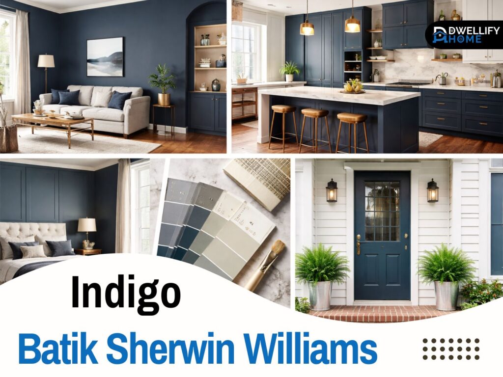
If you’ve been eyeing indigo batik sherwin williams for your home, you’re probably drawn to that deep, moody blue that feels classic without being flat. I get it. In my work as a color consultant, I’ve used Indigo Batik (SW 7602) in bedrooms, living rooms, dining rooms, and accent walls, and it can look beautiful when it’s chosen for the right room and paired with the right supporting colors.
That said, Indigo Batik is not a “slap it on the wall and it’ll magically work” shade. It absorbs light, it shifts with bulbs and daylight, and it can look very different from a small paint chip. This guide is how I walk homeowners through it, calmly and honestly, so you can decide if it fits your space.
Snippet-ready definition:
Indigo Batik (SW 7602) is a deep denim-like navy from Sherwin-Williams with a low LRV around 8, so it absorbs light and can show a soft gray, sometimes slightly violet, undertone.
Mission Statement:
At Dwellify Home, our mission is to help you choose paint colors with confidence by explaining how they behave in real rooms, under real lighting, with practical pairing tips that make your home feel like you.
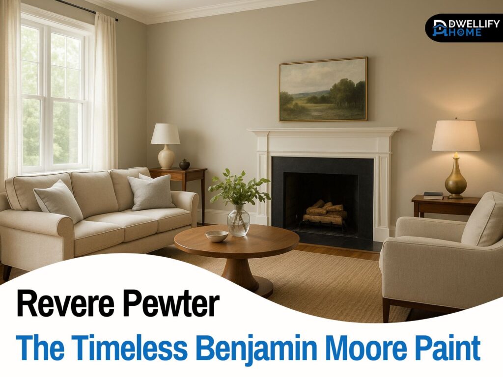
Indigo Batik SW 7602 — quick color snapshot
Indigo Batik is a deep blue that often reads like a worn denim or an inky navy in real rooms. It has presence, but it doesn’t feel overly bright or “primary blue.” That’s why it works so well for people who want color that feels grounded and grown-up.
In my experience, Indigo Batik is strongest when you treat it like a feature color. It’s excellent for an accent wall, built-ins, a kitchen island, or a front door. It can also work as a full-room color, but only when the room can support it with enough light and contrast.
Indigo Batik “at-a-glance” (the data homeowners care about)
You don’t need to memorize color codes to use this shade well. But you do need to respect one basic truth: Indigo Batik is a dark color that drinks in light. That means the same paint can feel cozy and rich in one home, and heavy in another.
A quick rule I use during consultations: if your room already struggles with natural light, plan to use Indigo Batik on one wall, or bring in brighter supporting elements, like lighter trim, lighter rugs, and layered lighting.
Quick guide table: Indigo Batik vs Hale Navy vs Salty Dog
| Color | Brand | LRV (light depth) | Undertone feel | Best use | Quick note |
| Indigo Batik (SW 7602) | Sherwin-Williams | ~8 | Blue with soft gray, can lean slightly violet | Bedrooms, accent walls, cabinetry, doors | Looks richer in low light, clearer in sun. |
| Hale Navy (HC-154) | Benjamin Moore | 8.36 | Classic navy with a maritime vibe | Whole rooms, built-ins, exteriors vary by product line | Often feels like a “true” traditional navy. |
| Salty Dog (SW 9177) | Sherwin-Williams | ~4.7 to 5 | Deep navy with charcoal influence | Doors, cabinets, accents | Usually darker and more saturated than Indigo Batik. |
Step-by-step: how to test Indigo Batik so it doesn’t surprise you
- Test large (at least poster-size) on the main wall.
- Check it 3 times a day: morning, midday, evening.
- Hold it next to trim and a plain white sheet to spot undertone shifts.
- Turn on your lamps at night, because dark blues change a lot under warm bulbs.
- Decide placement: if the room feels heavy, use it on one wall, cabinets, or a door instead of all four.
(That sampling step matters because Indigo Batik is described as a dark, saturated denim blue that changes noticeably with light.)
Indigo Batik Sherwin Williams undertones
Undertones are what separate “pretty online” from “right in your home.” Indigo Batik typically sits in a blue family with a soft gray influence. In some lighting, especially later in the day, you may notice a subtle violet lean. It’s not loud, but it’s there, and it’s part of what makes the color feel complex rather than flat.
I’ve seen homeowners get surprised when they expected a straightforward navy and ended up with something that feels slightly softer and moodier. If you love a denim-like blue with depth, you’ll probably enjoy that undertone behavior. If you want a very traditional, clean navy, you’ll want to compare it against a truer navy before you commit.
Why Indigo Batik can look different from house to house
Here’s what changes the “read” of Indigo Batik the most:
- Room exposure: north-facing rooms push it cooler and deeper, while south-facing light can make it feel clearer.
- Bulb warmth: warm bulbs can pull out a hint of violet, cooler bulbs can emphasize the blue-gray side.
- Surrounding finishes: warm woods and brass soften it, while cool grays can make it feel sharper.
I always tell people to judge Indigo Batik on a large sample, next to their flooring and their trim, not in isolation.
How Indigo Batik reacts to light in real rooms
Indigo Batik is one of those colors that can feel calm in daylight and dramatic at night. In bright, open rooms, it often looks like a rich denim navy. In dim rooms, it can move toward “inky” and feel heavier, especially if your trim and decor are also dark.
A real example: I used Indigo Batik for a dining room accent wall in a home with warm, evening-only lighting. During the day it felt polished and tailored. At night it felt much deeper, almost like a dark velvet backdrop. We solved it with two simple changes: brighter bulbs with a balanced warmth, and a lighter rug to bounce light back into the room.
A no-regrets sampling method (pro-style)
If you want one practical step that saves headaches, it’s this: test bigger than you think you need to.
- Put a large sample on the main wall you plan to paint.
- View it in morning, midday, and evening.
- Stand across the room and also right up close.
- Check it next to your trim color and a white sheet of paper.
This catches the undertone shifts early, before paint is everywhere.
Indigo Batik color palette that looks intentional
A good Indigo Batik color palette is all about balance. Because this shade is deep, it needs supporting colors that either brighten it, warm it up, or give it a clean contrast. When homeowners feel like a dark blue “is making the room feel smaller,” the palette is usually the missing piece, not the color itself.
Think of Indigo Batik as the anchor. Then you build around it with trim, neutrals, and a few accents that add warmth and texture.
Best trim and ceiling whites for Indigo Batik
Trim choice matters a lot with Indigo Batik. A crisp white gives a sharper, more modern contrast. A softer white feels calmer and more traditional.
In homes with warm floors or creamy stone, I often lean toward a softer white so the room doesn’t look too stark. In homes with cooler flooring or very clean modern finishes, a crisper white can look fresh and intentional. The goal is simple: make the trim look clean, and keep the blue from feeling muddy.
Coordinating neutrals that keep Indigo Batik friendly
If you want Indigo Batik to feel welcoming, pair it with warmer neutrals.
Greige, warm beige, soft taupe, and creamy off-whites tend to play nicely. They keep the room from feeling overly cool, especially in north-facing spaces. I’ve also had great results pairing it with natural textures like linen curtains, woven baskets, and warm oak tones.
Accent colors and materials that elevate Indigo Batik
When Indigo Batik feels high-end, it’s usually because of the materials around it.
A few combinations that consistently work:
- Brass or aged gold hardware and lighting for warmth
- Warm wood furniture or shelving to soften the blue
- Muted greens in plants or textiles to keep it natural
- Matte black in small doses for a crisp, modern edge
This is where your room stops feeling “painted” and starts feeling designed.
Indigo Batik Sherwin Williams vs Hale Navy
Homeowners ask me about this comparison a lot: indigo batik sherwin williams vs hale navy. They live in the same general mood, but they don’t behave the same.
Hale Navy (by Benjamin Moore) is a classic heritage-style navy. Indigo Batik tends to feel a touch more denim-like and nuanced. If you like a navy that feels slightly softened, Indigo Batik often wins. If you want a more traditional “navy navy,” Hale Navy can be the better fit.
Quick decision guide
Choose Indigo Batik if:
- you like a denim, inky look with a softer edge
- you’re pairing it with warm woods and brass
- you want moody without feeling harsh
Choose Hale Navy if:
- you want a very classic, traditional navy
- you prefer a cleaner, more uniform navy read
- you’re matching a heritage or coastal-traditional style
If you’re torn, test both on the same wall. The difference shows up fast once you see them under your own lights.
Similar colors and smart alternatives
Sometimes Indigo Batik is almost right, but not quite. Maybe it feels too deep in your hallway. Maybe the undertone isn’t what you expected. That’s when similar colors help.
If you want something close, consider comparing it with other deep blues that either read cleaner, slightly grayer, or slightly more traditional. The goal is not to chase a perfect name on a swatch. The goal is to find the color that behaves best in your space.
When you should pick an alternative instead
You might choose a different shade if:
- your room has very limited natural light
- the space is small and already feels tight
- your fixed finishes are very cool gray and make the blue feel colder than you want
There’s no shame in this. Dark blues are beautiful, but they’re also honest. They show you exactly what your lighting is doing.
Where to use Indigo Batik in your home
This is where Indigo Batik really earns its place. I’ve used it across multiple rooms, and the “best” room depends on how you want the space to feel and how much light it gets. If you’re thinking about an indigo batik sherwin williams room choice, the safest approach is to match the mood to the function.
Indigo Batik Sherwin Williams bedroom
For an indigo batik sherwin williams bedroom, I like it most when the room has at least some daylight and good bedside lighting. It can feel restful and cocooning, especially behind a headboard wall.
If the bedroom is very dim, I usually recommend using it on one wall, then keeping bedding lighter and adding warm wood tones. That way you get the mood without making the room feel closed in.
Living room and family room
In living rooms, Indigo Batik shines as an accent wall behind a sofa, around a fireplace, or on built-ins. Full-room use can work, but you’ll want strong support: lighter trim, a light rug, and layered lighting.
One simple trick: if you have white curtains, keep them generous and airy. They help the room feel taller and brighter against a deep blue.
Bathroom
Bathrooms can handle Indigo Batik better than people expect, especially with the right mirror and lighting. The key is reflectivity. Bright vanity lighting, a large mirror, and lighter countertops stop the color from feeling heavy.
If the bathroom is tiny with one small window, I’d keep Indigo Batik to a vanity, a door, or one wall instead of all four.
Kitchen walls vs built-ins
Kitchens are where Indigo Batik often looks most “designed.” It’s great for islands, lower cabinets, or built-ins. On walls, it can feel dramatic, but it’s not always the best choice unless the kitchen is large and bright.
Most homeowners are happier using it in a controlled way, then letting counters and backsplash keep the room fresh.
Indigo Batik Sherwin Williams cabinets
Indigo batik sherwin williams cabinets are one of my favorite uses for this color. It’s deep enough to feel intentional, and it hides everyday life better than lighter colors. Smudges and minor wear don’t jump out the same way they do on bright white cabinets.
I’ve used Indigo Batik on kitchen islands, lower cabinets, and built-in hutches. It tends to look especially good when the rest of the kitchen is light and warm.
Why Indigo Batik works on cabinets
On cabinetry, Indigo Batik reads like a classic statement. It gives contrast without shouting, and it pairs well with both modern and traditional styles. It also makes hardware and lighting feel more special, because they stand out.
If you’re nervous, start with an island or lowers only. It gives you the look with less risk.
Hardware and countertop pairing ideas
A few pairings that rarely disappoint:
- Brass or aged gold pulls warmth forward
- Polished nickel feels clean and timeless
- Matte black works in modern spaces if the room has enough light
- Light counters like white quartz or soft marble-look surfaces help the blue feel crisp
If your countertop has strong cool gray movement, sample first. Some cool grays can make Indigo Batik feel colder than you intended.
Best paint finish for cabinets
For cabinets, durability matters. A finish that can be wiped clean without looking shiny is usually the sweet spot. I typically steer homeowners away from dead-flat finishes on cabinets because fingerprints and cleaning marks can show.
If you’re painting yourself, follow proper prep and curing time. Dark blues look their best when the surface is smooth and even.
Indigo Batik Sherwin Williams door
An indigo batik sherwin williams door is a strong choice when you want curb appeal that feels classic. It’s deep, it looks great against white trim, and it plays nicely with natural materials like brick, stone, and wood.
I like it for front doors because it feels welcoming without being loud. It’s also a nice alternative to black if you want something softer and more personal.
Door finish and durability notes
Doors take abuse, so sheen and prep matter more than people think. A slightly higher sheen than wall paint usually holds up better to hands and cleaning. Also, make sure your door color works with the undertone of your exterior trim. That’s what keeps it looking intentional.
Indigo Batik Sherwin Williams exterior
For indigo batik sherwin williams exterior use, I treat it as an accent color first. It works beautifully on shutters, doors, and small architectural details. Full exterior use can work too, but it requires careful planning because sun exposure and surrounding materials have a big impact.
Outside, deep blues can look brighter than expected in strong sun. They can also shift cooler next to lots of greenery. That’s why sampling is just as important outdoors.
Exterior reality check (sun and surroundings)
Before committing, check these:
- how much direct sun hits the surface
- nearby brick, stone, roof, and hardscape tones
- landscaping, because greens can make the blue feel cooler
If your home sits in bright sun, Indigo Batik may read clearer and more saturated. In shaded areas, it can read deeper and moodier.
Common mistakes (and how to avoid them)
Most Indigo Batik regrets come from a few predictable issues, and they’re easy to prevent.
- Not testing in your lighting: it changes throughout the day.
- Choosing the wrong white: a mismatched trim white can make the blue look dull or the trim look dirty.
- Using it in a room that can’t support dark color: very small, dim spaces need a lighter plan.
- Picking the wrong sheen: especially on cabinets and doors, where durability matters.
If you handle these four things, Indigo Batik usually turns into a “why didn’t I do this sooner” color, not a “how do I fix this” color.
Expert tips to make Indigo Batik look high-end
When Indigo Batik looks expensive, it’s because the whole room is working together.
First, use contrast on purpose. Light trim and a lighter ceiling help the walls feel crisp and not heavy. Second, bring in warmth through materials. Wood, woven textures, and warm metals keep the blue from feeling cold. Third, layer your lighting. One ceiling fixture isn’t enough for dark paint. Add lamps, wall sconces, or under-cabinet lighting so the room stays comfortable at night.
If you want one simple checklist: contrast, warmth, and layered light. That’s the formula.
FAQs
1) What undertones does Indigo Batik have?
Most homes show a blue base with soft gray undertones, and in certain lighting you can catch a subtle violet lean. It’s one reason the color feels “denim” instead of flat navy.
2) Does Indigo Batik look purple?
It can, but usually only in warm indoor lighting or late-day light. In brighter daylight it tends to read more like a deep denim navy.
3) What is Indigo Batik SW7602?
It’s a Sherwin-Williams color named Indigo Batik (SW 7602) with an LRV around 8, meaning it’s quite dark and absorbs a lot of light.
4) What is the difference between Salty Dog and Indigo Batik?
Salty Dog is typically darker and more saturated, with a stronger charcoal depth, while Indigo Batik is usually a touch “denim” and slightly softer in feel.
5) What trim color looks best with Indigo Batik?
A clean white trim gives crisp contrast, while a softer white makes it feel calmer and more traditional. Your best pick depends on your flooring undertone and lighting.
Conclusion
Indigo Batik is a confident, livable deep blue when you respect what it needs: light, contrast, and a thoughtful palette. I’ve seen it make bedrooms feel calmer, living spaces feel more tailored, and kitchens look more custom, especially when it’s paired with the right trim white and warm materials.
If you’re still unsure, don’t force a decision off a tiny swatch. Sample it big, watch it through a full day, and compare it to one alternative navy. When Indigo Batik is the right fit, you’ll feel it, because the room will look settled, not heavy. And that’s exactly what a moody color should do.
Disclaimer:
Paint colors can look different depending on lighting, monitor settings, surrounding materials, and finish. Always test a large sample in your home before painting, and follow product instructions for proper prep and application.

I’m Bilal, the founder of Dwellify Home. With 6 years of practical experience in home remodeling, interior design, and décor consulting, I help people transform their spaces with simple, effective, and affordable ideas. I specialize in offering real-world tips, step-by-step guides, and product recommendations that make home improvement easier and more enjoyable. My mission is to empower homeowners and renters to create functional, beautiful spaces—one thoughtful update at a time.