
Colorful Christmas decor works best when you pick one color palette first and repeat it through your whole home. Choose three to five colors, give one color the biggest job, add one warm metallic such as gold, and repeat those same colors on your tree, mantel, and table. That repeat is what turns a pile of bright ornaments into colorful Christmas decorations that look planned, happy, and calm at the same time.
If you love bright color but fear a clash, you do not need fewer colors. You need a clearer plan. This guide gives you five ready palettes, a simple mixing method, and easy fixes for the spots that most often go wrong.
Start With a Palette, Not a Shopping Trip
Pull out the decorations you already own before you buy anything new. Sort them by color on a table or a bed, and look for the colors you already have in groups. Most homes already own a palette. You just need to spot it, trim it, and repeat it on purpose.
Use this simple split for any palette. Give your main color about 60 percent of what people see. Give a second color about 30 percent. Save the last 10 percent for one bright accent. This split keeps even a rainbow look grounded, because the eye always finds a home base.
Pick one metallic and stick with it in each room, a rule that also sits at the heart of Hillier’s colourful Christmas guide, which advises one metallic plus a neutral to balance a 4-to-6-colour palette. Gold warms up bright colors and suits red, pink, orange, and warm green. Silver cools them down and suits blue, teal, purple, and icy pink. Mix gold and silver only if you do it on purpose, in small doses, and in the same spot more than once.
Check color temperature too. Warm colors carry yellow or orange undertones, so warm red looks like tomato red. Cool colors carry blue or gray undertones, so cool red looks like berry red. When you mix a warm red and a cool red in one display, the pair can look slightly off even when both colors look fine alone.
The Multicolor Rainbow Palette: Bright, Even, and Full of Joy
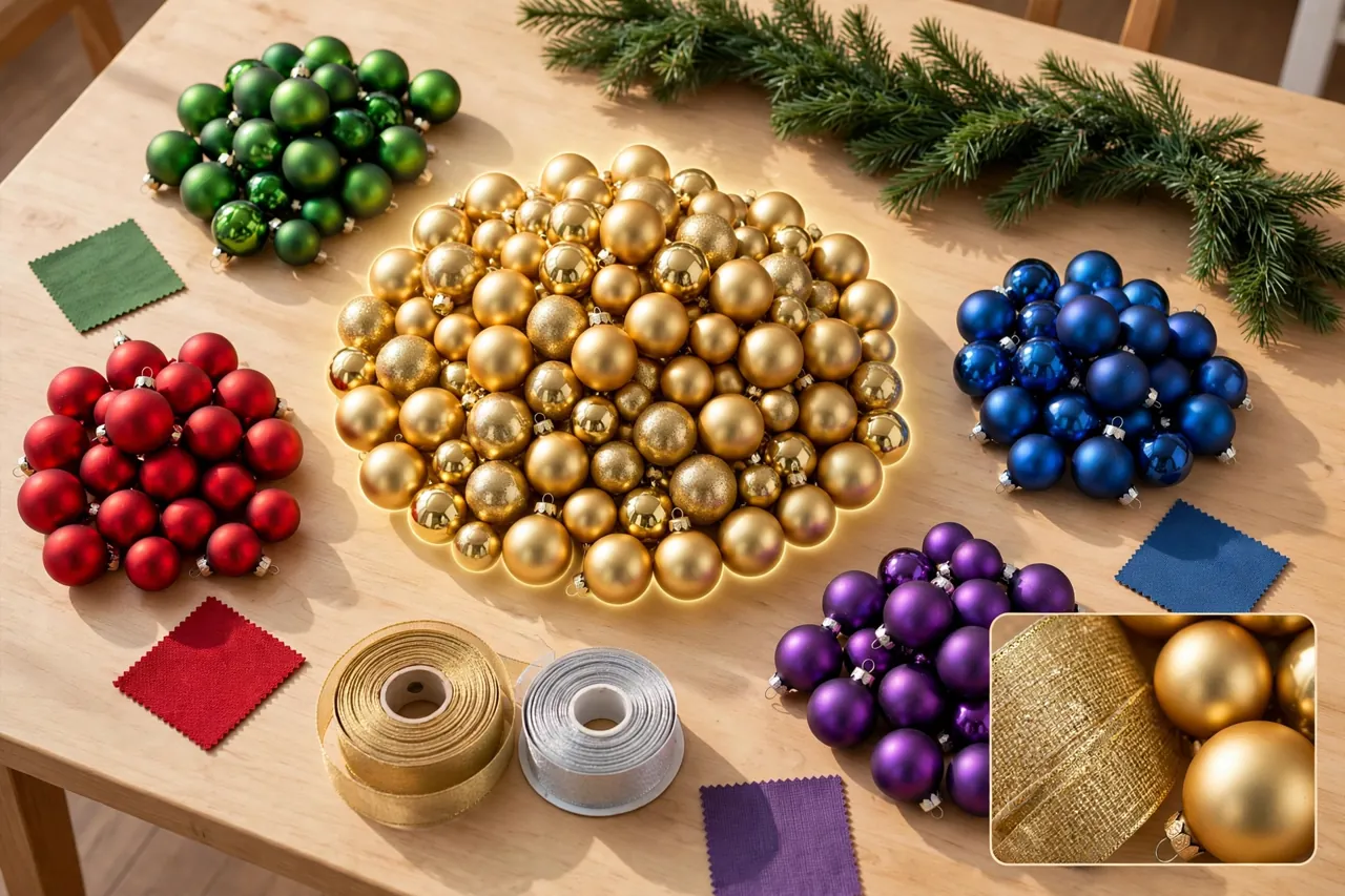
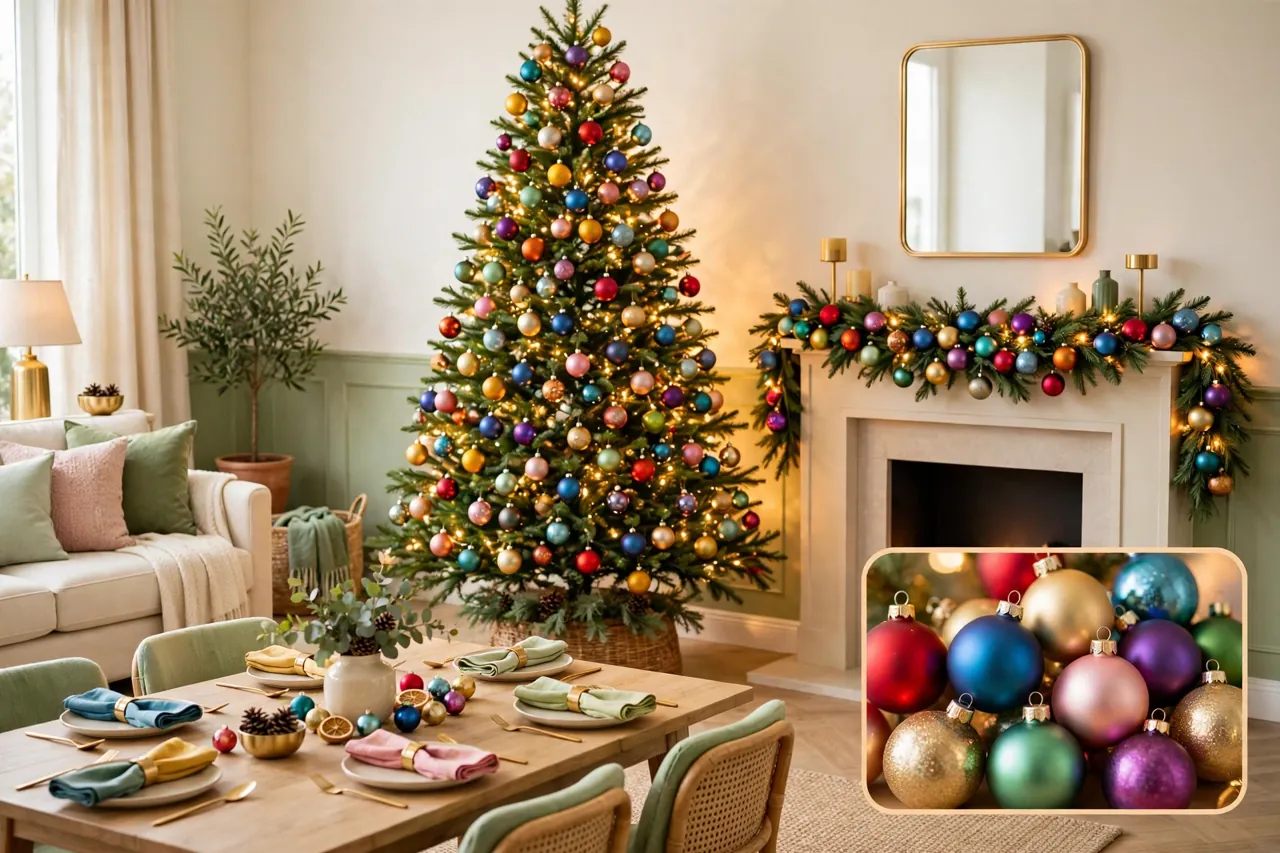
The rainbow palette uses red, orange, yellow, green, blue, and purple in one display. It suits families, kids, and anyone who loves a tree that looks like pure fun. It also fails fast when one color clumps in one spot, so spread matters more than shopping here.
Start with warm white lights. Warm white lights soften every bright color at once and stop the tree from looking harsh. Add multicolor lights only if you want extra energy, and keep the bulb style the same across the tree so the glow reads as one display.
Hang large ornaments deep in the branches and small ornaments near the tips. This layering adds depth and stops the front of the tree from looking flat. Then group ornaments in clusters of three or five, and repeat each color in several spots around the tree. Step back often. If you see one big blob of blue on one side and no blue on the other side, move a few pieces until the color travels all the way around.
Use green foliage as your anchor. The green of the tree, garland, or wreath gives bright colors a place to rest. A plain green tree skirt, a simple green garland, or plain green ribbon can calm a rainbow display without dulling it.
Carry the rainbow past the tree in small doses. Repeat two or three rainbow colors in napkins, gift wrap, or a bowl of ornaments, and leave the rest of the room calm. You do not need rainbow on every surface. A few clear repeats tell the eye that the whole home belongs to one plan.
The Jewel-Tone Palette: Rich Color That Still Feels Grown-Up
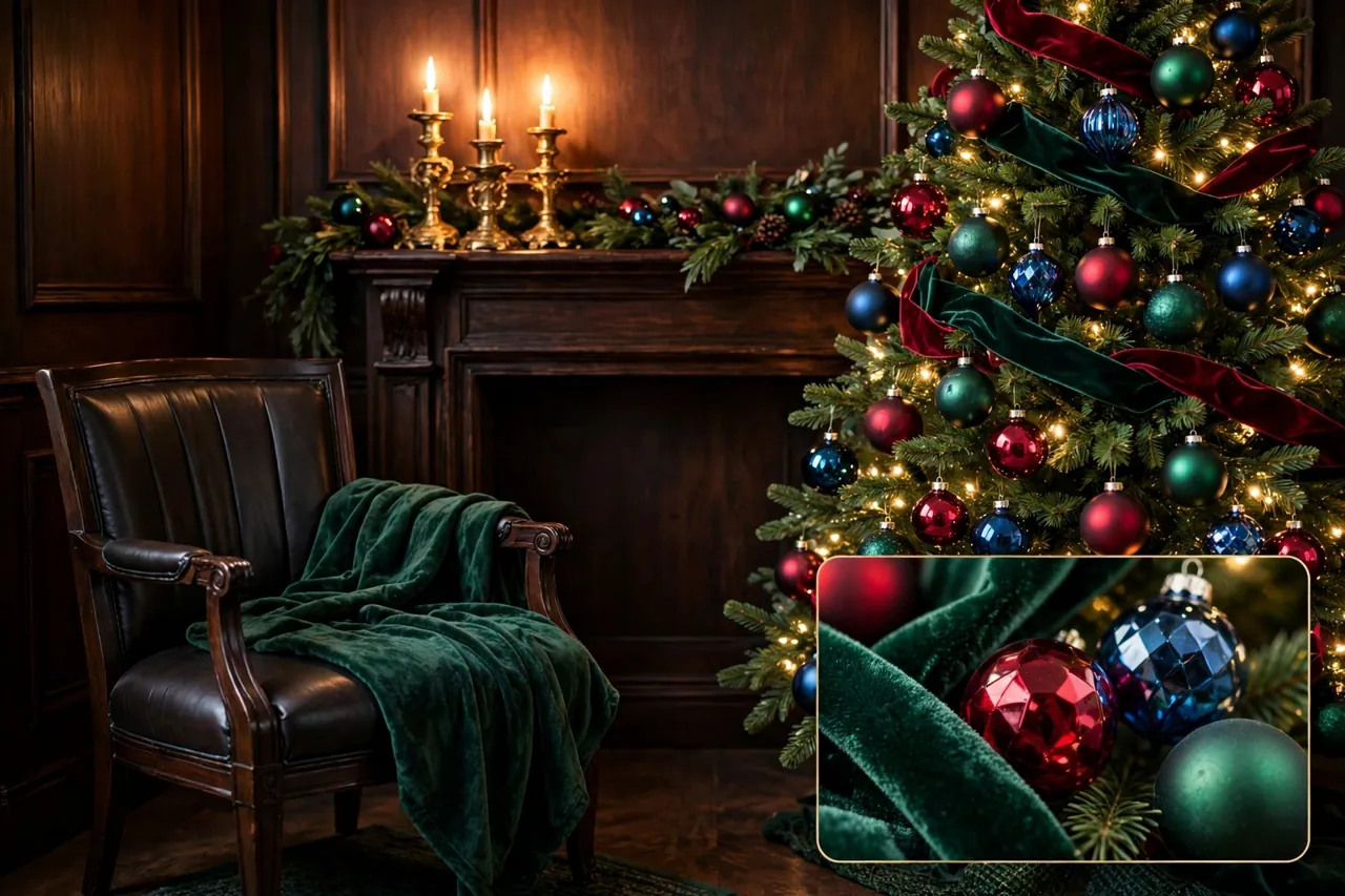
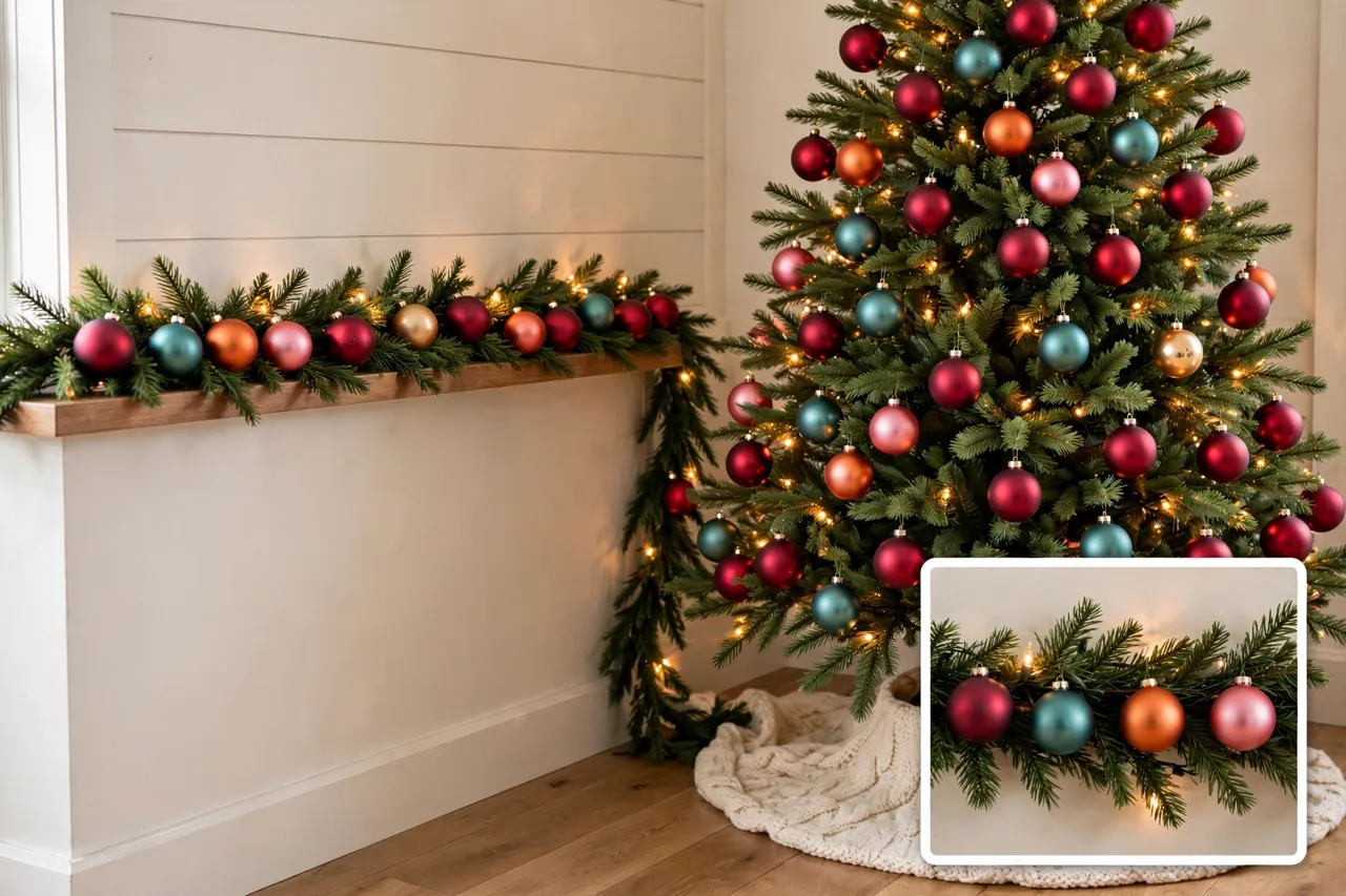
Jewel tones bring deep, rich color into Christmas without going dark or dull. Think ruby red, emerald green, sapphire blue, amethyst purple, and teal, with antique gold as the glue that ties them together. This palette suits candlelit rooms, velvet ribbon, and glass ornaments that catch the light.
Warm white lights flatter jewel tones best, a point Decorator’s Warehouse makes in its jewel-tone Christmas guide, which pairs hot pink, cobalt blue, and kelly green with champagne accents. They make ruby glow, sapphire deepen, and gold shine, while cool white lights can make the same colors look cold. If your room already runs warm, with wood floors and warm lamps, sapphire and teal can balance that warmth nicely.
Keep the palette tight. Pick three jewels at most, plus gold. For example, pair emerald and sapphire with gold, or ruby and amethyst with gold. Use the largest share for one jewel, a smaller share for the second, and the third jewel as an accent in ribbon, candles, or a few standout ornaments.
Mix finishes to keep deep colors lively. Pair glossy baubles with matte baubles, velvet ribbon with glass, and smooth metal with soft fabric. When every piece shines the same way, a jewel palette can look flat. When textures vary, the same colors look rich and layered.
Repeat one jewel beyond the tree. An emerald throw on a chair, sapphire napkins on the table, or gold candle holders on the mantel can carry the palette through the room. Keep the rest of the bedding, sofa, or tableware calm so the jewel colors stay the stars.
The Bright Playful Palette: Candy Color With a Calm Base
The bright playful palette mixes hot pink, aqua, lime green, and tangerine with white or cream. It feels fresh, young, and fun, and it photographs beautifully. It also needs a calm base, or the bright colors can shout over each other.
Use white or cream as your rest color. A white tree skirt, cream napkins, or a plain cream throw gives bright colors breathing room. On a green tree, bright colors pop hard. On a white or flocked tree, the same colors look softer and more playful, so test a few ornaments on your tree before you commit to a full set.
Pick one playful lead color and let the others support it. If pink leads, use aqua and lime as smaller pops, not equal rivals. If aqua leads, use pink and tangerine as accents. This lead-color rule stops a candy palette from turning into a random mix.
Add soft textures to balance the bright hues. Felt ornaments, pom-pom garland, knit stockings, and soft ribbon make bright colors feel cozy instead of loud. Add one metallic, such as silver or light gold, in small doses for sparkle. Keep glitter in clusters, not scattered everywhere, so the eye can rest between bright spots.
This palette suits kids’ rooms, small trees, and tabletops well. A small tree or a mantel display lets you go bold in one spot while the rest of the home stays calm. That one bold spot often becomes the photo spot guests remember.
The Warm Bright Palette: Red, Orange, and Gold, Lifted
The warm bright palette takes classic Christmas warmth and lifts it with orange, coral, and gold. It suits rooms with wood tones, brick, or warm light, and it feels festive without relying only on red and green. Think tomato red, tangerine, mustard gold, and warm green, tied together with gold ribbon.
Warm white lights suit this palette best. They deepen the gold and keep red and orange glowing, while cool white lights can make warm colors look washed out. Use the same warm white tone on the tree, garland, and mantel so the whole room glows as one.
Let gold do the unifying work. Gold ribbon, gold candle holders, or gold gift wrap can link red, orange, and green pieces that might otherwise compete. Repeat gold in at least three spots in the room, and keep the gold tone the same, so it reads as one choice, not three accidents.
Balance warm brights with plain greenery and cream. Fresh or faux greenery cools the heat of red and orange, and cream napkins or a cream table runner give the eye a rest. Without that calm base, a warm palette can feel heavy by the second week of December.
The Cool Bright Palette: Blue, Teal, and Purple, Kept Fresh
The cool bright palette mixes teal, cobalt blue, lavender, and purple with silver or cool white. It feels modern, crisp, and a little magical, and it suits rooms with gray walls, silver fixtures, or cool daylight. It can also turn cold fast, so warmth must come from light and texture, not from more color.
Use warm white lights with care here. A full warm white wash can fight cool colors. Instead, use cool white or soft white lights as the main glow, and add warm candlelight in glass holders for warmth at table or mantel height. That mix keeps the palette cool without making the room feel cold.
Pick teal as a bridge color when blue and purple sit together. Teal sits between blue and green, and it helps blue ornaments feel at home against green foliage. A teal ribbon can link a blue tree, a purple wreath, and silver accents into one story.
Add soft, warm textures to balance the cool hues. Velvet ribbon, knit throws, and wood bead garland warm up a cool palette without adding a new color. Keep silver as your one metallic here. Gold can work as a small accent, but equal amounts of gold and silver in one display often look unsettled.

How to Mix Colors Without Clashing: A Five-Step Method
Use this method before you hang a single ornament. It takes about fifteen minutes, and it saves hours of moving pieces around later.
- Pick your mood word. Choose one word, such as joyful, rich, playful, warm, or fresh. Let that word guide every color choice after it.
- Pick one main color. Give this color the biggest share of the display. It anchors the whole look.
- Add one or two support colors. Choose colors that sit well with your main color, not colors that fight it for attention.
- Add one bright accent. Use this color sparingly, in ribbon, a topper, candles, or a few standout ornaments.
- Add one metallic and one calm neutral. Use gold or silver as the metallic, and warm cream or soft gray as the neutral that lets bright colors rest.
Next, make a small swatch test. Lay fabric scraps, ribbon, and a few ornaments together in daylight and in evening light. Colors shift under different lights, so a pair that looks fine at noon can clash at night. Test before you buy a full set.
Finally, use the squint test. Stand back about ten feet, squint until the tree or mantel blurs, and look for big blobs of one color. Move pieces until the color spreads evenly. A balanced display looks like an even wash of color when blurred, not a patchwork of separate blocks.
Repeat Your Palette on the Tree, Mantel, and Table
Your palette, not your rooms, should lead the plan. Once you pick your colors, repeat the same two or three colors in each display, and let the size of each display change, not the colors.
On the tree, use your full palette, with large ornaments deep in the branches and small ornaments near the tips. On the mantel, repeat the same colors in smaller doses, such as ribbon, stockings, and a few ornaments tucked into garland. Cluster pieces in threes or fives so the mantel looks grouped on purpose, not scattered by chance.
On the table, repeat your palette through napkins, ribbon, and one centerpiece color, and keep plates and glasses calm. If you want ideas for the table layout itself, read our guide to Christmas table settings and then dress that layout in your palette colors. A runner or napkins in your main color can tie the table to the tree without a full table makeover.
Carry the palette to the door in one small repeat, such as a wreath ribbon in your main color. Our guide to Christmas decorations on the front door shows how a door display can welcome guests in the same colors they will see inside. One repeat at the door is enough. The door should hint at the palette, not use up the whole palette.
If you need help picking a whole tree look first, our guide to Christmas tree themes can help you choose a theme, and then you can dress that theme in any palette in this article. Keep the theme and the palette as two separate choices. The theme sets the style, and the palette sets the colors.
Colorful Lights: The Fastest Way to Change the Mood
Lights change color more than any ornament can. Warm white lights flatter mixed colors and suit most palettes, because they add a soft, candle-like glow. Multicolor lights add energy and suit rainbow and playful palettes best, but they need a consistent bulb style to look planned.
Give each zone one palette, as The Christmas Light Emporium advises for light displays. Use one light scheme on the tree, one on the mantel garland, and one outside, and let warm white act as the link between zones when zones differ. For example, warm white trees plus a colored roofline often read cleaner than colored trees plus a colored roofline.
Do not mix warm white and cool white on the same strand or the same branch level unless you place them on purpose in separate zones. Mixed whites on one run often look accidental. If you want both, use warm white as the main glow and cool white as a single accent, such as one window outline or one small tree.
Test all lights before you hang them, and keep bulbs clear of fabric and dry foliage. Check cords for wear each year, and replace any faulty strand before you use it. Battery lights work well for garlands and spots far from outlets, and timers help you manage lighting hours without leaving lights on all night.
Fix the Five Mistakes That Make Color Look Messy
Mistake 1: Every color gets an equal share. When five colors compete at equal strength, the eye finds no rest. Fix it with the 60-30-10 split, and let one color lead.
Mistake 2: One color clumps in one spot. A cluster of blue on one side and no blue anywhere else looks like an accident. Fix it by repeating each color in at least three spots in each display.
Mistake 3: Warm and cool versions of one color mix. Warm red and cool red, or warm white and cool white on one run, can look slightly off. Fix it by picking one temperature side for each color and sticking with it.
Mistake 4: Too many metallics compete. Gold, silver, and copper at equal strength fight each other. Fix it by picking one main metallic and using the second only in tiny accents.
Mistake 5: No calm spot for the eye. Bright color on every surface tires the eye fast. Fix it with plain greenery, cream fabric, or a plain tree skirt that gives bright colors room to shine.
For living-room displays, the same fixes apply at room scale. Our guide to decorating ideas for a living room at Christmas can help you place your palette in the room, while this article keeps your colors in balance.
Shop Your Home First, Then Buy Only the Gaps
Colorful decor does not need a full new set each year. Start with what you own, sort by color, and buy only the pieces that fill a gap in your palette. A spool of ribbon in your main color, a set of napkins in your accent color, or a few matte ornaments in your support color often fixes a display for less than a whole new theme set.
Keep sentimental ornaments, even when they fall outside your palette. Give them a small memory spot, such as a side table tree or a single shelf display, where they can shine on their own. That choice honors family pieces without letting one off-palette ornament pull your main display off course.
Store ornaments by palette, not by year or by box size. Label one box per palette, and add a small swatch of ribbon to the outside. Next December, you can pull one palette box and start decorating at once, instead of sorting a mixed box all over again.
Keep safety in mind with bright displays. Hang glass ornaments higher up, out of reach of small kids and pets, and use shatterproof ornaments lower down. Use LED lights, keep cords out of walkways, and never leave lit candles near garland, ribbon, or dry foliage.
Palette at a Glance
Table: Five colorful Christmas palettes and where each one shines.
| Palette | Main colors | Best lights | Best for |
|---|---|---|---|
| Rainbow | Red, orange, yellow, green, blue, purple | Warm white | Family rooms and kids |
| Jewel tone | Ruby, emerald, sapphire, gold | Warm white | Candlelit, grown-up rooms |
| Bright playful | Pink, aqua, lime, tangerine | Warm white | Small trees and tabletops |
| Warm bright | Red, orange, mustard, gold | Warm white | Wood and brick rooms |
| Cool bright | Teal, cobalt, lavender, silver | Cool or soft white | Modern, gray-toned rooms |
Related Guides
If you want to build out your whole home in one palette, these live Dwellify Home guides can help: Christmas tree themes for picking a tree look, Christmas table settings for dressing your table in your colors, decorating ideas for a living room at Christmas for placing color in the room, and Christmas decorations on the front door for carrying one palette color outside.
Frequently Asked Questions
How many colors should I use in my Christmas display?
Two to three colors suit most displays, and a rainbow display can use more only when one color leads and the rest repeat evenly. Beyond three colors in one zone, you risk visual noise unless you plan a full multicolor look on purpose. Repeat each color in at least three spots.
Can you mix LED Christmas light colors on the same display?
Yes, and mixing colors often adds depth to a display. Give each zone one palette, such as one scheme for the tree and one for the roofline, and keep the bulb style consistent across zones. Random color changes on one strand tend to look messy, while zoned color looks planned.
Do warm white and cool white Christmas lights look good together?
They can, but only with deliberate placement. Use warm white as your main glow and cool white as one clear accent, such as a single window outline or one small tree. Mixing warm white and cool white on the same run often looks accidental and can make colors look off.
What is the most popular Christmas light color combination?
Warm white remains the single most popular choice for home displays, while classic red and green remains the most recognized holiday-specific pairing. Multicolor runs close behind, especially in homes with a nostalgic or family-friendly style, according to The Christmas Light Emporium.
How do I make a colorful, busy tree look cohesive?
Anchor the tree with one consistent element, such as warm white lights, a solid tree skirt, or one ribbon color used all over. Spread bright pieces evenly instead of clustering them, step back often, and repeat each color around the whole tree. A calm base and even repeats turn busy color into a planned display.
Pick your palette tonight, sort what you already own by color, and test your swatch in evening light. Then hang your main color first, add your support colors, and save your bright accent for last. That one order keeps colorful Christmas decor joyful, balanced, and easy to love all season long.