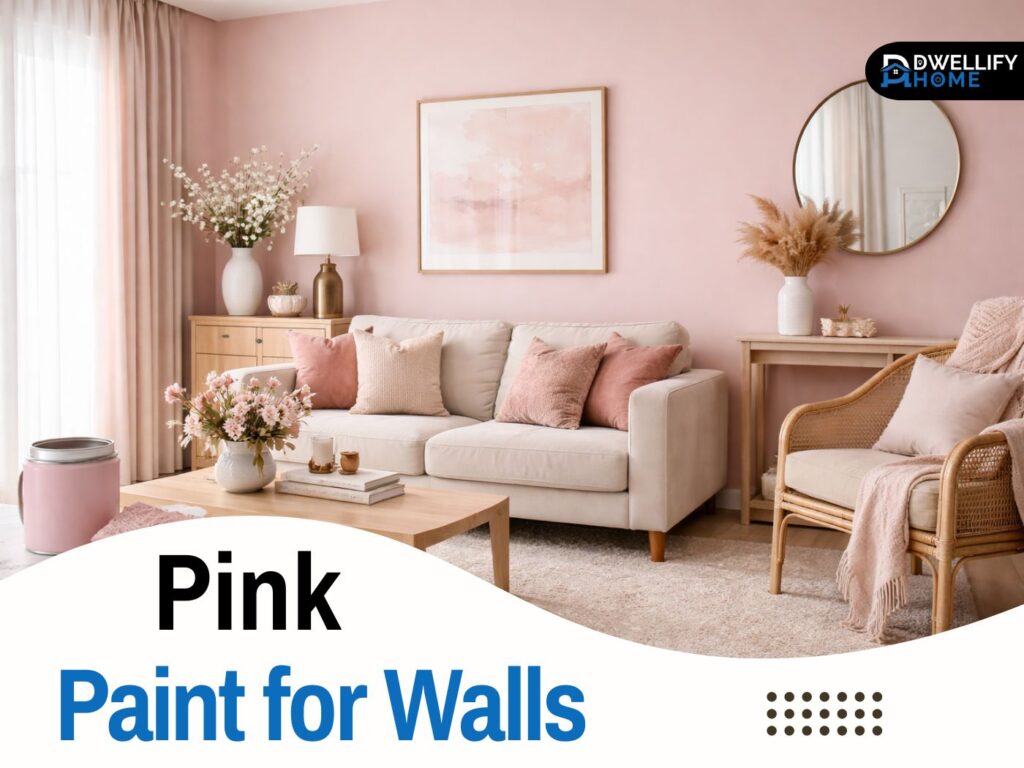
Pink has quietly become one of the most flexible wall colors I use in real homes. Not the loud, sugary pink people worry about, but the softer, dustier, warmer versions that behave almost like a neutral.
If you’ve ever painted a sample that looked perfect online and then turned peach, purple, or oddly beige on your wall, you’re not imagining things. Pink is one of the most light-sensitive color families, so a little planning upfront makes a big difference.
In this guide, I’ll walk you through how I choose pink tones with clients, how undertones and lighting change the final look, and how to style pink so it feels refined instead of overwhelming.
Snippet-ready definition:
Pink paint for walls is a versatile color choice that can feel soft, warm, or bold depending on undertones and light. People use it to add comfort, style, and personality without making a room feel heavy.
Mission Statement:
At Dwellify Home, our mission is to help you make confident, livable design choices with practical guidance, honest color advice, and real-home styling tips that feel calm, modern, and doable.
Pink Paint for Walls at a Glance (Pick the Right Type First)
The easiest way to get a result you’ll love is to decide what role pink will play in your room. Do you want it to feel like a soft backdrop, a cozy mood color, or a statement moment?
Here’s how I think about it in plain terms. Light blush and soft pastel pinks lift a space and feel airy. Dusty pink and muted rose shades read more modern and “grown-up.” Dark pink wall paint, like berry or deep rose, adds depth and can make a room feel intentionally designed.
Also, pink often acts like a bridge color. It can connect warm wood floors to cooler fabrics, or soften a room full of stone, black accents, and sharp lines. That’s why it works so well in newer homes with mixed finishes.
Quick Guide Table: Choose the Right Pink Fast
| What you want | Best pink direction | Best rooms | Pair with | Best finish |
| Soft and airy | Light blush, soft pastel | Bedroom, hallway, nursery | Warm white, light oak, linen | Matte or eggshell |
| Warm and cozy | Warm rosy, peach-pink | Living room, entry, guest room | Cream, beige, brass, wood | Eggshell |
| Modern neutral | Dusty pink, muted rose | Living room, office, bedroom | Greige, taupe, black accents | Eggshell |
| Moody statement | Dark rose, berry, deep pink | Dining room, powder room, accent wall | Deep wood, navy, brushed metal | Eggshell or satin |
Step-by-step: How to Test Pink Paint the Right Way
- Pick 2 samples: one slightly warmer, one slightly dustier than your first choice.
- Paint a large test area (or a sample board) and move it around the room.
- Check it 3 times: morning, afternoon, and night with your lamps on.
- Compare next to fixed finishes: flooring, tile, countertops, sofa fabric.
- Choose trim white last: most pinks look best with a softer warm white, not a icy bright white.
How to Choose Pink Paint for Walls (So It Looks Stylish, Not Childish)
Choosing pink is less about the color name and more about what sits underneath it. Two “blush” paints can look completely different once they’re on your wall. That’s usually undertone at work.
When I’m helping a homeowner choose, I focus on three things: undertone, lighting, and what the pink needs to do in that space. Once you get those right, pink becomes surprisingly easy.
Start with undertones (warm vs cool vs dusty or greyed)
Warm pink paint for walls usually has peach, coral, or a tiny hint of orange underneath. It feels welcoming and pairs beautifully with warm whites, natural wood, and brass.
Cool pinks lean mauve or lilac, with a slight violet or blue undertone. These can feel calm and modern, but in cold light they sometimes go a little “lavender” if you’re not expecting it.
Dusty pink sits in the middle. It’s softened with grey or beige, so it looks more muted and sophisticated. If you’re nervous about pink, this is often the safest direction.
Light matters: north-facing vs south-facing rooms
North-facing rooms tend to have cooler, flatter light. In those spaces, cool pinks can look more purple, and some pale pinks can look a bit grey. I usually lean warm or dusty there to keep the room feeling comfortable.
South-facing rooms get warm, bright light for much of the day. Warm pinks can look more peachy, and deeper pinks can glow. If you want a true blush in a sunny room, pick one that has a touch of grey to keep it balanced.
A quick real-world example: I once used a soft blush in a north-facing bedroom and it looked slightly mauve by late afternoon. We switched to a warmer blush with a beige base, and it immediately read as soft pink again without feeling cold.
The 4 Most Useful Pink Families (With When to Use Each)
I like keeping choices simple. In practice, most pink wall shades fall into these four families, and each one has a “best use” that makes the decision easier.
Warm pinks work best when your home already has warm materials like oak floors, creamy trim, tan rugs, or brass lighting. Light pink paint for walls is ideal when you want softness without a strong color statement. Dusty pink is the modern neutral option. Dark pink paint for walls is best used where you want mood and depth.
If you’re torn, look at your fixed finishes first, like flooring, countertops, and tile. Your pink should either match that temperature or gently counterbalance it, not fight it.
Best Pink Paint for Walls (Shortlist by Mood and Style)
Rather than listing dozens of paint names, I recommend choosing by how you want the room to feel. This keeps the process realistic, especially when every brand’s pink shifts a little in different lighting.
If you want an everyday pink that works in most homes, go for a dusty blush or muted rose. These are the shades that look stylish with white trim, wood furniture, and neutral upholstery.
If you want warmth, choose a peach-pink or coral-leaning blush, especially in living rooms and entryways. For an airy look, pick a light pastel pink with a beige or grey base so it doesn’t turn bubblegum.
For drama, choose a deeper rose or berry tone and consider using it on a single wall first. Dark pink can look elegant, but it needs the right supporting materials, like warm metals, deep wood, or crisp black accents.
A practical tip I use with clients: pick two candidates, one slightly warmer and one slightly dustier than you think you need. When you test them, the “too muted” one often ends up looking just right once it’s on a full wall.
Pink Paint Colors for Bedrooms (Including Light Pink Paint for Bedroom)
Bedrooms are where pink shines because it naturally reads as soft and comforting. The key is choosing a shade that supports sleep, not one that feels energetic.
Light pink paint for bedroom walls is great when you want a gentle, fresh look that still feels neutral. Dusty rose and soft mauve are also strong choices because they create a calm mood without feeling overly sweet.
If you’re decorating a nursery or kids’ room, you can still keep it modern. I often use a muted blush on the walls and bring the playful color through artwork and textiles. That way the room can grow with the child.
For a master bedroom, I like pairing pink walls with creamy bedding, warm wood nightstands, and soft black accents. It feels grounded and adult, not themed.
Pink Wall Paint Ideas (Room-by-Room, Practical and Realistic)
In a living room, pink works best when it’s acting like a warm neutral. Think dusty blush with warm white trim, light oak tones, and textured fabrics. It gives the space softness without taking over the design.
In dining rooms, deeper pinks can be beautiful because they make the room feel intentional and cozy, especially in evening light. Add a warm metal chandelier or sconces and you’ll notice the color feels richer, not louder.
Kitchens can handle pink more than people expect. A pale blush wall with warm wood shelves looks clean and modern. If you have white cabinets, a muted pink wall can keep the kitchen from feeling too stark.
Bathrooms are a great place for pink, especially blush or dusty rose. Pair it with stone or marble-look tile and brushed brass, and it feels spa-like. Just make sure the finish is moisture-friendly and wipeable.
Hallways and entries often lack natural light, so I prefer a warm, light pink with a beige base. It brightens the space in a welcoming way without looking sugary.
Feature Wall vs Full Room (What Looks Best in Pink)
If you’re unsure about commitment, a pink accent wall is a smart starting point. It lets you enjoy the color without covering the whole room, and it’s easier to adjust if the undertone surprises you.
A feature wall works well behind the bed, around a fireplace, or in a dining area. It’s also ideal for darker pinks, where four walls might feel heavy.
Full-room pink works best with lighter or dustier shades. When the pink is muted, it wraps the room in softness and feels cohesive, especially if your trim and ceiling are chosen carefully.
One small trick: if you’re going full-room, consider painting the trim a softer white rather than a stark bright white. It helps the whole palette blend smoothly.
What Colors Go With Pink Walls (Easy Pairing Guide)
Pink is surprisingly flexible, but it looks best when the supporting colors are chosen with intention.
If you want a safe, timeless look, pair pink with warm whites, cream, beige, or greige. These combinations feel soft and calm, and they’re easy to decorate around.
For something more designer but still livable, pink and green is a favorite. Dusty rose with olive or forest green looks balanced because the two colors sit beautifully together. Pink with navy is another classic, especially in bedrooms and offices.
Pink with black accents can look very modern, but keep the pink muted so it doesn’t feel harsh. Add warmth through wood and brass so the space still feels inviting.
Trim and ceiling matter here. With most pinks, a warm white trim looks better than a cool, bluish white. If your trim looks “icy” next to the wall, it can make the pink look strange, even if the paint is fine.
Paint Finish Matters (Bedrooms vs Living Areas vs Kitchens and Baths)
Finish is one of those details people skip, and then they wonder why the wall looks patchy or too shiny. Pink especially shows texture and sheen differences, so choosing the right finish helps the color look smooth and intentional.
For bedrooms, matte is beautiful if the walls are in good shape. It gives a soft, velvety look that flatters blush and dusty rose. If you need a bit more durability, eggshell is usually the sweet spot.
For living rooms and hallways, I often use eggshell because it’s easier to clean and holds up to daily life. Satin can work too, but on large walls it can show more reflection, which sometimes changes how pink reads.
For kitchens and bathrooms, pick a finish that handles moisture and wiping. A quality eggshell or satin tends to perform best there. And no matter the room, good surface prep makes pink look more even, especially with lighter shades.
How to Test Pink Paint (The No-Regret Method)
Testing is where you save yourself from repainting. I’ve seen pink look soft and warm on a sample card, then swing coral at noon and mauve at night. That’s normal, and testing catches it.
Instead of a tiny swatch, paint a large sample area or use a sample board you can move around. Check it in morning, afternoon, and evening, with your regular lamps on too. Pink changes a lot under warm bulbs versus cool LED lighting.
Also compare it next to your flooring, your sofa fabric, and any major wood pieces in the room. Pink can pull very different depending on whether it’s next to cool grey, warm tan, or deep walnut.
If the color looks “almost right” but slightly off, don’t panic. Usually the fix is choosing a similar shade that’s either a touch dustier or a touch warmer. Small shifts make a big difference with pink.
Common Mistakes With Pink Paint for Walls (And Simple Fixes)
The biggest mistake I see is choosing a pink that’s too bright or too clean. Those are the ones that can feel childish or overpowering once they’re on all four walls. Fix it by moving one step dustier, or using the shade as an accent wall instead.
Another common issue is ignoring undertones. A cool pink in a cool room can look purple. A warm pink in strong sunlight can look peach. Fix it by matching undertone to your room’s light temperature, or by choosing a balanced dusty pink.
Skipping sample tests causes most regrets. Pink is just too reactive to guess. Testing on a large swatch and checking it through the day is what keeps the final result predictable.
Lastly, trim color gets overlooked. A bright, cool white trim can clash with pink and make it look odd. If that happens, switching to a softer warm white trim often solves the problem without changing your wall color.
Quick FAQs
Is pink a good wall color?
Yes, if you choose the right undertone for your lighting. Dusty and warm pinks can read like a modern neutral, while deeper pinks work well as accent walls.
What is the popular pink for 2025?
Muted, dusty blush tones have been popular because they feel calm and flexible. They pair easily with warm whites, wood, and modern black accents.
What is the most beautiful pink color?
The “most beautiful” pink is the one that stays balanced in your room’s light. For many homes, a soft dusty rose is flattering because it doesn’t turn too peachy or too purple.
What is the most popular wall paint color right now?
Warm off-whites and soft greige are still common picks because they work with many finishes. Pink is often used as a modern neutral alternative when you want more warmth and personality.
Should I use pink on all four walls or just one?
Light and dusty pinks can look great on all four walls. Dark pink usually looks best on a feature wall unless the room is large and gets good light.
Conclusion
Pink can be soft, modern, and surprisingly practical when you treat it like a design decision, not a trend. Start by choosing the right undertone for your light, then decide whether you want a subtle neutral backdrop or a deeper statement.
If you only take one tip from years of client work, let it be this: test larger than you think you need, and check the color at different times of day. That’s where pink reveals its true personality.
Once you get the shade and finish right, pink paint for walls becomes one of those choices that quietly makes a home feel warmer and more personal, without needing a lot of extra decor to carry the look.
Disclaimer
Paint colors can shift based on lighting, screen settings, and surrounding materials. Always test samples in your space before committing, and choose finishes based on your room’s wear and moisture needs. This article is for general design guidance and isn’t brand-affiliated.

I’m Bilal Hassan, the founder of Dwellify Home. With 6 years of practical experience in home remodeling, interior design, and décor consulting, I help people transform their spaces with simple, effective, and affordable ideas. I specialize in offering real-world tips, step-by-step guides, and product recommendations that make home improvement easier and more enjoyable. My mission is to empower homeowners and renters to create functional, beautiful spaces—one thoughtful update at a time.