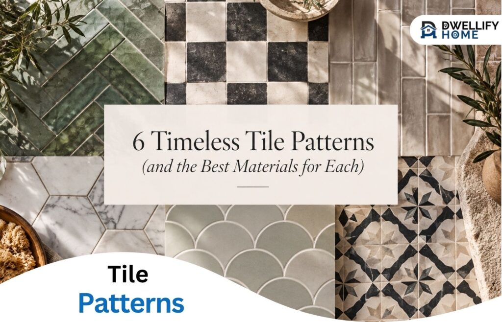
We’ve all seen it happen: a specific tile color is absolutely everywhere one year, only to vanish from mood boards the next. If you’re planning a renovation, it’s natural to look for choices that will stand the test of time. That’s where timeless tile patterns come in.
Classics like the herringbone, checkerboard, and running bond endure because they are incredibly adaptable.
By simply changing the material, the scale, or the direction of the tiles, you can take the exact same geometry from a cozy traditional kitchen to a sleek, modern bathroom.
But here is the secret to getting it right: the material matters just as much as the arrangement. The tactile, imperfect edge of a handmade zellige tile behaves very differently than the crisp, clean lines of a cut stone.
To get the look you love, you have to consider the whole picture, matching the perfect geometric pattern with the perfect material to execute it.
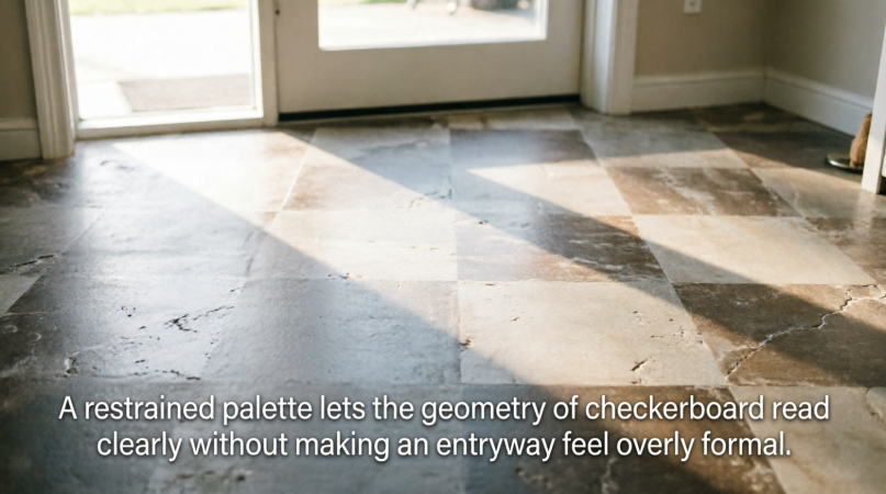
1. Checkerboard: best in stone, cement or terracotta
Checkerboard is one of those rare patterns that can move between grand and relaxed interiors with very little adjustment.
The traditional version uses two strongly contrasting colors, but contrast does not have to mean black and white. Cream and warm brown, terracotta and off-white, or two muted cement colors retain the alternating rhythm while softening the graphic effect.
Stone is a natural choice when the goal is a refined floor with visible veining and tonal movement. Cement brings a matte surface and greater freedom with color. Terracotta makes the pattern feel earthier because differences between individual pieces loosen the otherwise precise grid.
Entryways are particularly suited to checkerboard because the pattern establishes a clear visual identity in a relatively contained area.
When choosing artisan entryway tile for foyers, consider the room beyond the front door as well as the foyer itself. The palette should establish the home’s material language rather than feel like an isolated decorative moment.
Before installation, lay out enough of the floor to see how color variation is distributed. With natural or handmade materials, alternating colors is only one part of the composition. Veining, tonal shifts and individual markings also need to feel balanced across the room.
2. Herringbone: best in rectangular ceramic, stone or terracotta
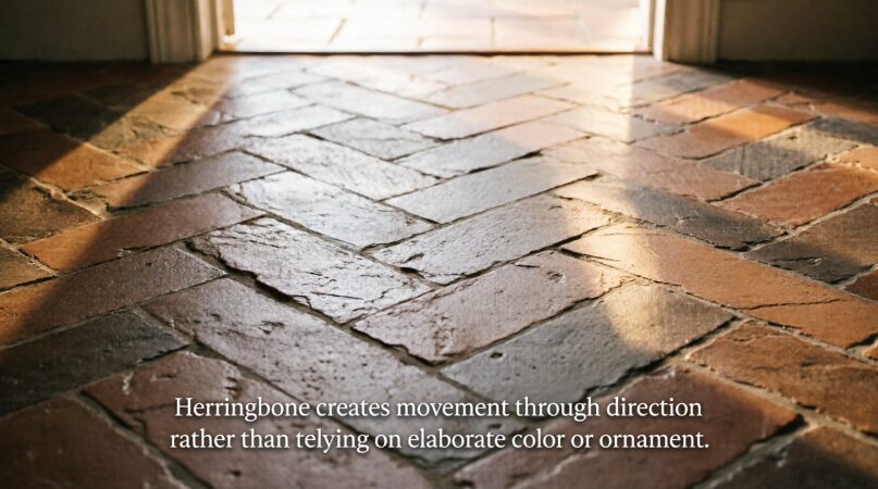
Herringbone gets its energy from a simple move: rectangular pieces meet at right angles to create a continuous zigzag.
The pattern is expressive enough to carry a room in a single color, which makes material choice especially visible. Ceramic produces a cleaner, more controlled result. Stone introduces veining across the changing directions, while terracotta gives the pattern warmth and irregularity.
The starting point matters. A herringbone installation that is only slightly off-center can become increasingly obvious as it travels across a floor. Establish the primary sightline first, particularly in an entryway where the front door creates a natural viewing axis.
Dry-laying a section also helps determine where cuts will fall. This follows the same practical principle we use when planning diagonal tile layouts: resolve the prominent sightline and awkward perimeter cuts before setting begins.
Herringbone also requires more cuts than a straight grid, so material quantities should account for the additional waste created by the layout.
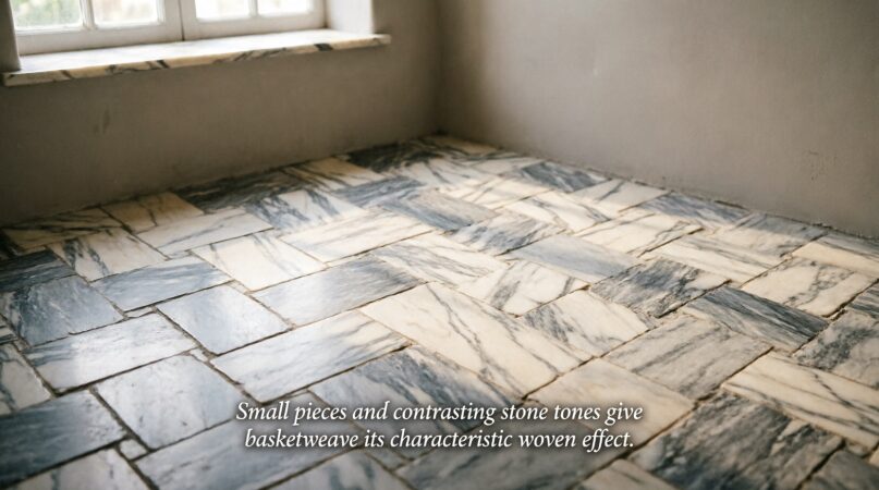
3. Basketweave: best in marble and other natural stone
Basketweave is more intricate, but it does not need to feel busy.
The pattern is built from small rectangular pieces arranged to suggest interlocking strips, often with contrasting square inserts. Natural stone suits the format particularly well because subtle veining prevents all those small components from reading as a completely flat graphic surface.
Marble remains the classic choice. White or cream stone paired with darker inserts creates definition, while a more tonal combination makes the pattern quieter.
Dwellify Home’s guide to basketweave marble looks more closely at how the pattern works in bathrooms and entryways, two spaces where its smaller scale can provide detail without dominating the architecture.
Many basketweave products arrive on mesh-backed mosaic sheets. Those sheets simplify placement, but they do not eliminate the need for careful layout. Sheet boundaries can become visible when spacing between sheets differs from spacing between individual pieces. An installer should periodically step back from the work and check the overall field rather than concentrating solely on one sheet at a time.
4. Running bond: best in ceramic, zellige and subway formats
Running bond may be the most familiar tile layout on the list, but familiarity is also its advantage.
Each row is offset from the one before it, creating a pattern that has movement without demanding attention. It works particularly well when the tile itself has something interesting to say.
Handmade ceramic and zellige are strong examples. Slight changes in edge, glaze and surface texture introduce irregularity within the predictable pattern. Rather than adding another decorative device, the straightforward layout gives those material differences room to register.
With larger rectangular tiles, however, the amount of offset deserves consideration. Some tiles have slight bowing, and aligning the highest point of one tile with the lowest area of the neighboring tile can exaggerate lippage. Manufacturer recommendations for the chosen format should guide the offset.
For handmade material, joint width should also respond to actual dimensional variation rather than being chosen solely from a styled photograph.
5. Straight stack: best in handmade ceramic and richly varied tile
Straight stack is the simplest geometry here: one tile directly above and beside the next.
Because there is nowhere for alignment errors to hide, it can also be one of the most demanding layouts to execute well.
A highly calibrated porcelain or ceramic tile creates a crisp architectural grid. Pair the same pattern with handcrafted tile and something more interesting happens. The grout lines provide order, while irregular edges and tonal changes soften the repetition.
That tension works especially well in contemporary interiors where cabinetry, trim and architectural details are already restrained.
The substrate needs to be properly prepared because a straight grid makes waves and inconsistencies easier to notice. Reference lines should be established before setting begins, and the layout should be checked repeatedly rather than assuming each preceding row will keep the next one true.
Grout contributes strongly to the finished effect as well. A close tonal match lets the material dominate, while contrasting grout makes every joint part of the composition. Our guide to sanded and unsanded grout covers the practical differences between grout types and where each may be appropriate.
6. Diagonal: best in stone, terracotta and square-format tile
Diagonal tile proves that a familiar material does not need an elaborate shape to create impact.
Rotating square tiles 45 degrees turns a basic grid into a pattern that moves across the room. It can be especially effective in compact foyers, small halls and other transitional spaces where a conventional grid might emphasize the room’s boundaries.
Stone works beautifully because the diagonal geometry gives veining a changing direction. Terracotta offers a more relaxed interpretation, particularly when natural tonal differences are allowed to remain visible.
The tradeoff is at the perimeter. A diagonal layout creates more angled cuts, so setting out the floor accurately before installation is important. Tiny triangular pieces along a prominent wall or threshold are rarely desirable. Shifting the entire field slightly can often produce fuller, more intentional cuts.
Borders can also be useful. A straight border around a diagonal field creates a clean transition to walls and thresholds while visually containing the pattern.
Pattern is only as good as the planning behind it
A timeless pattern does not guarantee a timeless-looking room. Scale and execution still determine whether it feels considered.
Before committing, look at the pattern from the doorway and from adjoining rooms. Check where full tiles land, where cuts appear and whether grout lines collide awkwardly with thresholds, cabinetry or architectural features.
Material variation should be reviewed at the same stage. Stone may need pieces distributed according to veining. Handmade tiles are often best blended from multiple boxes so differences in tone and texture are dispersed across the installation rather than concentrated in one area.
Substrate preparation is equally important. Patterns cannot compensate for an uneven base, and precise layouts can make poor preparation more noticeable.
Floor flatness, appropriate setting materials and movement accommodation should be addressed according to the tile manufacturer’s requirements and applicable installation standards.
Finally, choose the material for the application before choosing it for the pattern. Entryways deal with grit, moisture and concentrated foot traffic. Bathrooms introduce water exposure. Kitchen floors need to tolerate regular cleaning and spills. A tile that looks right in a pattern still needs the appropriate performance characteristics for where it will be installed.
The most enduring tiled rooms get both decisions right. The pattern provides structure, while the material gives that structure its personality. Herringbone can be crisp or rustic. Checkerboard can be stately or understated. A straight grid can feel minimal or visibly handmade.
That flexibility is precisely what has kept these six patterns relevant for so long.
Transparency is important to us. Certain links throughout this article may be affiliate or sponsored links through which Dwellifyhome.com may earn a small commission. These partnerships help support our website and ongoing content creation.